— Francisco Goya
Francisco Goya is one of my favorite artists. His work has a beautiful darkness that tells a lot about his experience in his time. In this post, we’ll dive into his world using the Metropolitan Museum of Art (MET) application programming interface (API), which gives developers access to data on hundreds of thousands of artworks.
You will learn how to interact with the MET API using Python. We will journey through the process of making HTTP requests, parsing the returned JSON data into a structured pandas DataFrame, and exploring the collection to extract meaningful insights about Goya’s work.
1. Requesting data from the API
We begin by importing the requests library, which allows us to send HTTP requests to the MET REST API in Python. We’ll query the search endpoint to find Goya’s paintings. In API terms, an endpoint is a specific URL used to access a particular resource.
The MET API has four endpoints starting with “https://collectionapi.metmuseum.org/”:
- GET /public/collection/v1/objects returns a listing of all valid
objectIDavailable to use. - GET /public/collection/v1/objects/[objectID] returns a record for an object, containing all open access data about that object, including its image (if the image is available under Open Access).
- GET /public/collection/v1/departments returns a listing of all departments of the museum.
- GET /public/collection/v1/search returns a listing of all
objectIDfor objects that match the search query.
You can find more details about each endpoint and its functionality in the official MET API documentation.
content_copy Copy
import requests
import pandas as pd

search_query = "https://collectionapi.metmuseum.org/public/collection/v1/search?hasImages=true&q=Francisco Goya"

response = requests.get(search_query)
search_data = response.json()

print(f"Found {search_data['total']} artworks for Francisco Goya.")
API endpoints can be followed by query parameters that refine our search. In the example above, hasImages=true filters for objects with images, and q specifies our search term—in this case, the artist’s name.
The requests library contains a method called get(), which we use to send our request to the API, passing our endpoint saved in the string search_query.
The resulting response object can then be parsed into a JSON structure using the .json() method.
2. Converting JSON to a list of painting ids
While JSON is the standard for data exchange, working with raw JSON can be cumbersome for direct data analysis. In Python, you can think of JSON as a dictionary of keys and values. These values can themselves be other dictionaries, lists, numbers, strings, or booleans. By printing the search_data object, we can see that it’s a dictionary containing two main keys:
- total: An integer representing the total number of objects returned.
- objectIDs: A list containing the unique IDs of the artworks matching our search.
To retrieve the list of IDs associated with the key “objectIDs” we use the standard dictionary notation search_data["objectIDs"] and save it to the variable goya_ids.
content_copy Copy
print(search_data)
goya_ids = search_data["objectIDs"]
3. Getting the details of each of Goya’s works
To retrieve details for each artwork — such as its title, date, and thematic tags — we need to iterate through the list of IDs and send a request to the /objects/{objectID} endpoint for each item. We implement this using a for loop that repeats the request for each artwork.
(Note: Depending on the number of results, fetching these details can take a few minutes. We use time.sleep(1) to respect the API’s rate limits and avoid being blocked.)
content_copy Copy
import time

all_objects_data = []


for object_id in goya_ids:
    try:
        obj_response = requests.get(f"https://collectionapi.metmuseum.org/public/collection/v1/objects/{object_id}")
        obj_response.raise_for_status()
        all_objects_data.append(obj_response.json())
    except requests.exceptions.RequestException as e:
        print(f"Error for object ID {object_id}: {e}")

    time.sleep(1) # Respect the API, one request per second to be safe

# Convert the gathered data to a DataFrame
goya_df = pd.json_normalize(all_objects_data)

# Filter only Goya works
goya_df = goya_df[goya_df['artistDisplayName'].str.contains('Goya', na=False)]
We use a try-except block to ensure the loop continues even if a specific object ID fails to load. We also log any errors to help with debugging.
Finally, we convert the collected data into a Pandas DataFrame using pd.json_normalize. Since a broad search might return works about Goya or mentioning him in metadata, we filter the DataFrame to ensure the artistDisplayName actually contains “Goya.”
The resulting DataFrame contains intriguing data about each of his works, including name, year when the painting or drawing was started and finished, descriptive tags and dimensions, among other information. Feel free to explore it. We will continue working with the descriptive tags in the next steps.
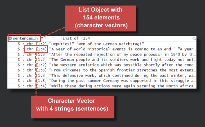
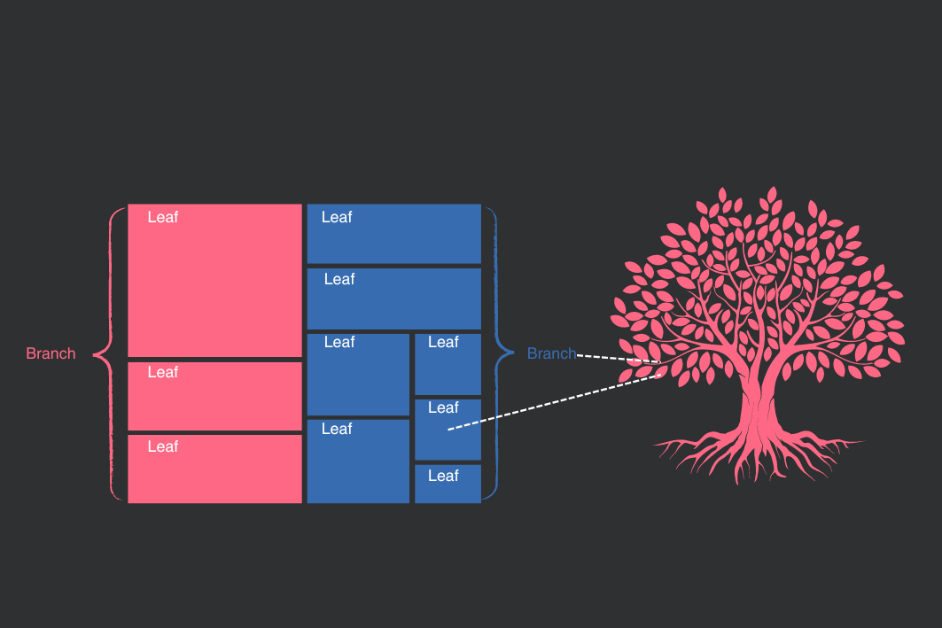
4. Flattening nested JSON data
For keys whose values are lists or other dictionaries, the resulting columns will contain those respective objects. This happens, for example, with the tags column. When you have nested elements like this, you can “flatten” them into a tabular format.
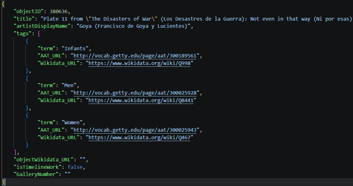
JSON data structure
Flattening an element changes the granularity of the data. Whereas before each row represented a single artwork, in the flattened table each row represents an individual tag belonging to one artwork.
To flatten these nested tags, we can use json_normalize by specifying the element to unnest in the record_path. We also include the objectID in the meta parameter so we don’t lose the relationship between a tag and its original artwork. Later on, we can join this tags table back to our main DataFrame if we want.
content_copy Copy
tags_df = pd.json_normalize(
    all_objects_data,
    record_path='tags',
    meta=['objectID']
)
5. Visualizing the most frequent themes
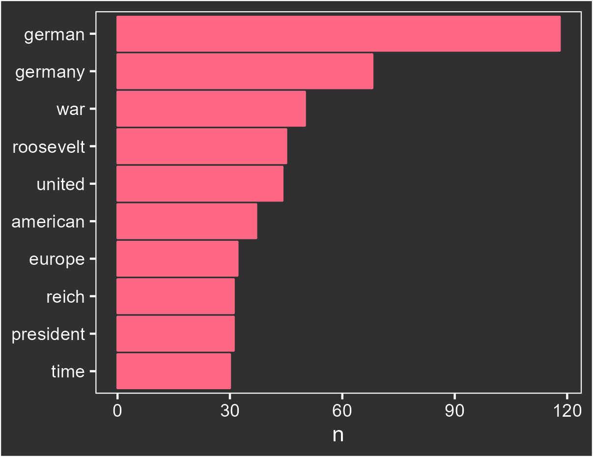
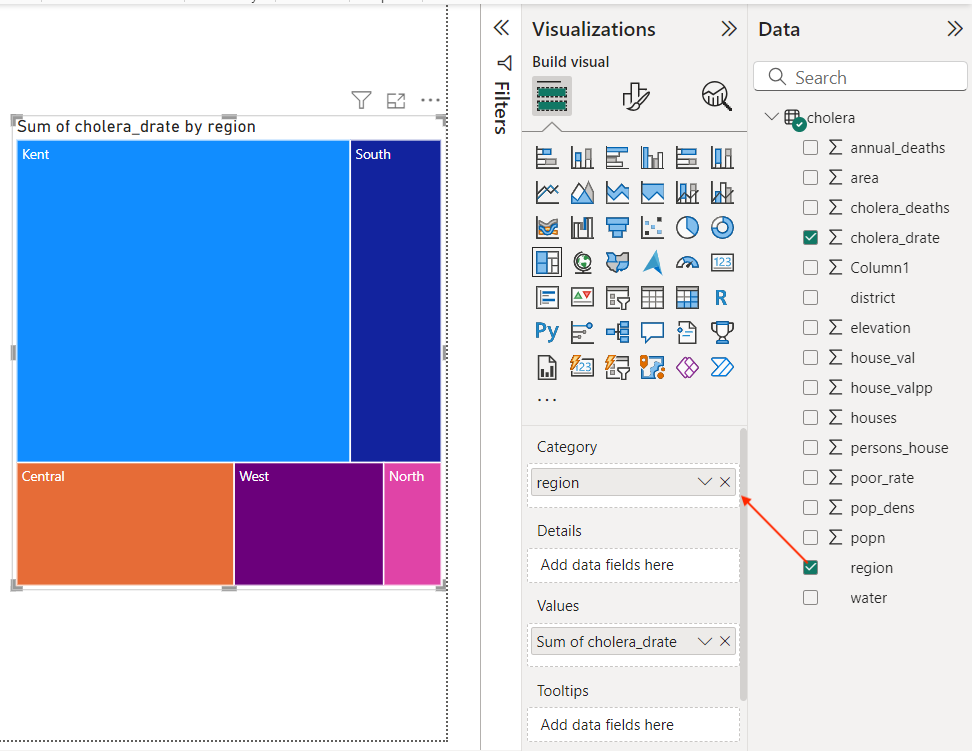
The MET API provides a tags field containing descriptive terms associated with each artwork. To understand the prevailing themes in Goya’s works — famous for documenting the social upheaval and dark realities of his era — we can extract these terms and calculate their frequency.
Once we isolate the individual tags into a new column, we can use matplotlib to create a horizontal bar plot of the top 10 terms and check if indeed his artwork contained themes related to death and misery.
content_copy Copy
import matplotlib.pyplot as plt

# Calculate the frequency of each term for the filtered Goya artworks
# We filter tags_df to only include IDs present in our filtered goya_df
term_frequency = tags_df[tags_df['objectID'].isin(goya_df['objectID'])]['term'].value_counts().reset_index()
term_frequency.columns = ['term', 'count']

# Select the top N terms for better readability if there are many unique terms
# For this example, let's take the top 10 terms
top_terms = term_frequency.head(10).sort_values(by='count', ascending=True)

plt.figure(figsize=(12, 8))
plt.barh(top_terms['term'], top_terms['count'], color='#FF6885')

plt.title('Top 10 Most Frequent Terms in Goya Dataset', fontsize=20)
plt.xlabel('Frequency', fontsize=16)
plt.ylabel('Term', fontsize=16)
plt.xticks(fontsize=14)
plt.yticks(fontsize=14)
plt.tight_layout()
plt.show()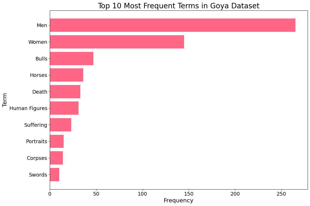
Top 10 Most Frequent Terms chart
The resulting visualization provides a fascinating window into Goya’s thematic world. Beyond common subjects like “Men,” “Women,” and “Portraits,” we see a strong representation of “Bulls” (reflecting his famous Tauromaquia series) and “Self-portraits.”
Most strikingly, terms like “Death” and “Suffering” appear prominently in the top 10. This data-driven insight confirms Goya’s historical reputation as an artist who didn’t shy away from the darker aspects of the human experience. By quantifying these themes through the MET API, we move from subjective observation to empirical evidence of his artistic focus.
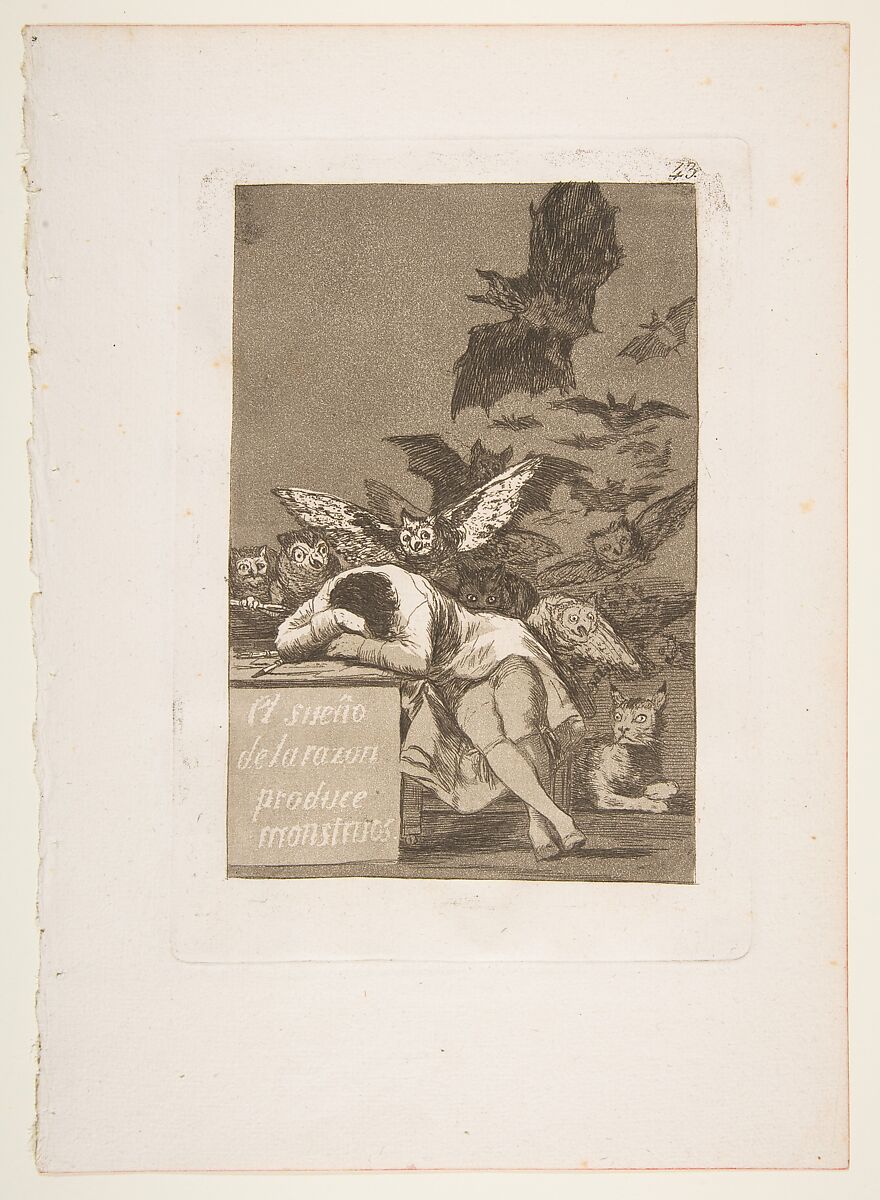
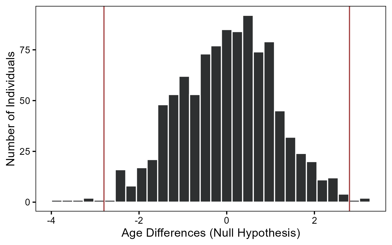
Plate 43 from "Los Caprichos": The sleep of reason produces monsters (El sueño de la razon produce monstruos)
You could also use the main dataset we created to collect a series of images of Goya works. I am thinking of using AI to help me download all images of Goya in the public domain and try to build a model to describe or classify them in Python. Feel free to use the data and let me know about your analysis. Leave your comments or any questions below and happy coding!
Conclusions
- The
requestslibrary combined withpd.json_normalizemakes extracting and structuring data from web APIs both seamless and efficient. - Navigating public collections like the MET API enables us to perform large-scale data analysis on historical and cultural artifacts.
- Combining data extraction with clear visualizations (using Matplotlib) provides interpretable insights into an artist’s thematic legacy and creative focus.
]]>
 The Hertie School Building. Source: Zugzwang1972, CC BY 3.0, via Wikimedia Commons
 DataCamp Method. Source: AI Generated.
 Main Resources Used to Learn R. Source: Author.