R programming for climate data analysis and visualization
What you will learn
- Learn what is linear regression and the intuition behind it;
- Be able to fit a model with the R lm() function using real world data;
- Learn how to interpret linear regression results.
Table of Contents
Introduction
‘Intuition is a very powerful thing, more powerful than intellect’
Steve Jobs
Linear regression is one of the most popular tools in social data science. It has been used over the last decades to study how variables relate to each other. In this lesson, you will learn the intuition behind linear regression and how to use it in R.
Data Source
Data for this lesson comes from two different sources: data of historical temperature in the city of Oxford comes from the National Centers for Environmental Information and historical data regarding total carbon emissions comes from the US Carbon Dioxide Information Analysis Center. Temperatures are given in degree Celsius and carbon emissions in million metric tons of C.
Coding the Past: Linear Regression in R
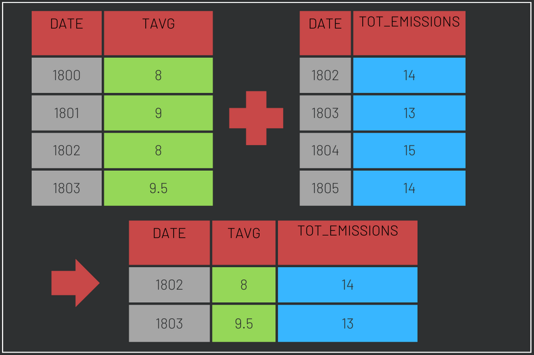
1. Join climate data and CO2 records using inner_join in R
First, we will use the data prepared for the lesson ‘Climate data visualization’. Please, download it here
Second, the carbon emissions data will be loaded. We will only load the year and the value regarding the total carbon emissions from fossil fuel consumption and cement production (in million metric tons of C).
Data will be loaded with read.csv. The selection of rows and columns is made by index using the following syntax: df[rows to include, columns to include]. In the code bellow we chose to keep all rows except for the first, because it contains the source of the data. Additionally, only columns 1 and 2 are kept. Column names are changed to be the same as in the temperatures dataframe. Since both variables were loaded as factors, we convert them first to characters and then to integers. Note that converting a factor directly to integer would distort the values.
content_copy Copy
temperatures <- load("temperatures.RData")

carbon <- read.csv("carbon.csv")[2:265, 1:2]

names(carbon) <- c("DATE", "TOT_EMISSIONS")

carbon$DATE <- as.integer(as.character(carbon$DATE))

carbon$TOT_EMISSIONS <- as.integer(as.character(carbon$TOT_EMISSIONS ))
The last step of data preparation is to join the two dataframes. Since they cover different periods, R dplyr inner_join() will be used to keep only observations contained in both dataframes. See how inner_join() works in the figure below:
content_copy Copy
df <- inner_join(temperatures, carbon, by = "DATE")If you prefer to skip this step, download the prepared data here (.RData format)
2. Correlation between carbon emissions and temperatures with R cortest
Correlation measures how much two variables change together. In our case, we would like to know if increases in carbon emissions are associated with increases in temperature. One method to assess linear correlation is the Pearson correlation. It ranges from 1 to -1, where 1 means perfect positive correlation, 0 means no correlation at all and -1 means perfect negative correlation.
In R, we can use the function cor.test() to estimate correlation with the argument method set to “pearson”. This function returns the correlation and a p-value. The p-value tells us if we can reject the hypothesis that the correlation between carbon emissions and temperature is zero.
content_copy Copy
cor.test(df$TAVG, df$TOT_EMISSIONS, method = "pearson")If you run the code above, you will see that there is a moderate linear correlation of 0.57 between temperature and carbon emissions in our sample. This means that when emissions increase, so does temperature. Moreover, this value is statistically different from zero, since the p-value is a lot lower than 0.05 (with a 95% confidence interval). So, there is a correlation between the two variables!
3. Plotting correlation in r
One way to check correlation is with a scatterplot. Because carbon emissions were relatively low before 1900, we will use data from this year on (see how dplyr filter() works). Notice that dots are not randomly distributed in the plot. In general, the larger the emissions, the larger the temperatures. To customize our plot, we will use the ggplot theme developed in the lesson ‘Climate data visualization’
content_copy Copy
theme_coding_the_past <- function() {
  theme_bw()+
  theme(# Changes panel, plot and legend background to dark gray:
        panel.background = element_rect(fill = '#2E3031'),
        plot.background = element_rect(fill = '#2E3031'),
        legend.background = element_rect(fill="#2E3031"),
        # Changes legend texts color to white:
        legend.text =  element_text(colour = "white"),
        legend.title = element_text(colour = "white"),
        # Changes color of plot border to white:
        panel.border = element_rect(color = "white"),
        # Eliminates grids:
        panel.grid.minor = element_blank(),
        panel.grid.major = element_blank(),
        # Changes color of axis texts to white
        axis.text.x = element_text(colour = "white"),
        axis.text.y = element_text(colour = "white"),
        axis.title.x = element_text(colour="white"),
        axis.title.y = element_text(colour="white"),
        # Changes axis ticks color to white
        axis.ticks.y = element_line(color = "white"),
        axis.ticks.x = element_line(color = "white")
  )}

ggplot(data = filter(df, DATE > 1900), aes(x= TOT_EMISSIONS, y = TAVG, color = TAVG))+
  geom_point(alpha = 0.6, size = 5)+
  scale_color_gradient(name = "ºC", low = "#1AA3FF", high = "#FF6885")+
  xlab("Emissions [million metric tons of C]")+
  ylab("Annual Mean Temperature in Oxford [ºC]")+
  theme_coding_the_past()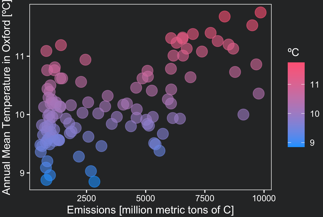
4. Linear relation between weather data and carbon emissions
Linear Regression studies the relationship between a dependent and an explanatory variable. It predicts the mean value of the dependent variable given certain values of the explanatory variable. In our case, we would like to describe how temperatures vary according to total carbon emissions, that is, the dependent variable is temperatures and the explanatory (independent) variable is carbon emissions. Clearly more variables other than carbon emission are capable of explaining temperature variation, but for this example we will use a simplified model with only one explanatory variable.
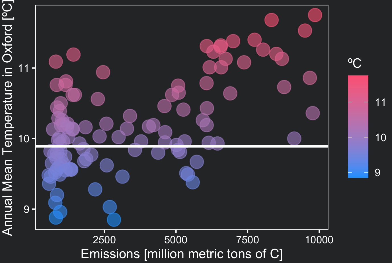
One quick question before we proceed: What is the simplest “model” for describing the temperature in Oxford throughout the last centuries if we did not have any other variable than the temperature itself?
It could be the average of the temperature over the period, right? At any point in time, this simple “model” would predict a 9.9 ºC temperature:
Now imagine that we have access to a second variable, the total carbon emissions, and we know it has a correlation with temperatures. Wouldn’t this variable add information to better predict temperature? Yes!
Linear regression is a method to relate these two variables through a straight line (a linear function) that might fit the data a lot better than the mean (if they are sufficiently associated). In the figure above, imagine that you could rotate this line to better fit the data: this is what the regression line does! (see plot in step 5)
A regression line is described by the equation Y = a + bX where a and b are found by an algorithm so that the line best fits the data.
Thankfully, you do not need to worry how to compute a and b. R does it for you with the lm() function, where you specify your dataframe, and the formula of the relationship you want to study. A formula has the following syntax: independent variable ~ dependent variable. To model temperature as a function of carbon emissions, use the following code:
content_copy Copy
linear_model <- lm(TAVG~TOT_EMISSIONS, data = df)

summary(linear_model)| Term | estimate | std.error | statistic | p.value |
|---|---|---|---|---|
| Intercept | 9.5627927 | 0.0546872 | 174.863537 | 0 |
| Emissions | 0.0001628 | 0.0000166 | 9.835066 | 0 |
In this table you see the coefficients a (intercept) and b (coefficient of TOT_EMISSIONS) calculated by R. They form the regression line TAVG = 9.57 + 0.00016*TOT_EMISSIONS. The interpretation of them is as follows:
- a or the intercept is the value of y when x is zero. In our case a is the value of the temperature when the emissions are zero. You have to evaluate if x = 0 makes sense for your analysis.
- b is how much, on average, y increases when x increases by 1 unit. In our example, when total emissions increase by 1 million metric tons of carbon, then the temperature increases by 0.00016 ºC. It does not seem a lot at a first glance, but if you consider that from 1950 to 2022 emissions increased by 8,225 million metric tons of carbon, this would translate, in our model, to an increase of 1.3ºC!
Note that p-values are zero (very close to zero), providing evidence that a and b are statistically significant.
5. Use geom_smooth to visualize the regression line
To draw the regression line, use geom_smooth() with the argument method set to ‘lm’ (linear model). The argument se specifies if you would like to plot the error associated with the regression estimate across the line.
content_copy Copy
ggplot(data = filter(df, DATE > 1900), aes(x= TOT_EMISSIONS, y = TAVG, color = TAVG))+
  geom_point(alpha = 0.6, size = 5)+
  geom_smooth(method = "lm", color = "white", size = 1, se = FALSE)+
  scale_color_gradient(name = "ºC", low = "#1AA3FF", high = "#FF6885")+
  xlab("Emissions [million metric tons of C]")+
  ylab("Annual Mean Temperature in Oxford [ºC]")+
  theme_coding_the_past()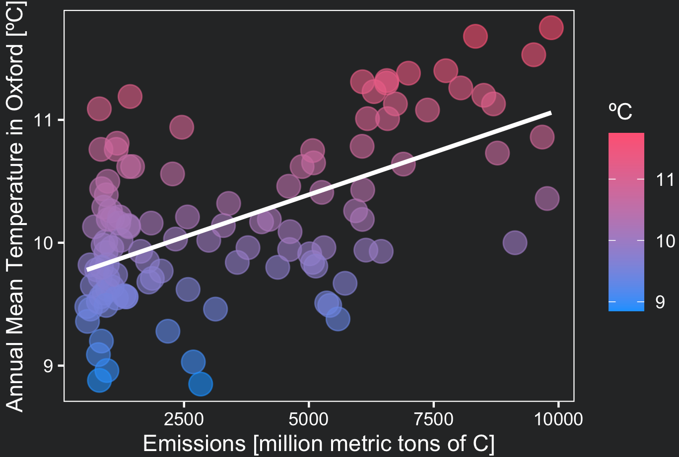
Conclusions
- An inner join can be used to join two dataframes when you only want to keep observations contained in both dataframes;
- Correlation measures how much two variables change together, it can be calculated in R with cor.test();
- A linear regression model relates one dependent variable to an independent or explanatory variable. It provides you with an estimate of how much the dependent variable vary when the independent variable changes by one unit. Regression can be computed in R with lm();
Comments
There are currently no comments on this article, be the first to add one below
Add a Comment
If you are looking for a response to your comment, either leave your email address or check back on this page periodically.