Storytelling with Matplotlib - Visualizing historical data
What you will learn
- Dive deep into Matplotlib's functionalities;
- Customize your plots for a clearer presentation;
- Learn how to identify and highlight important components in your graph.
Table of Contents
Introduction
‘Crafting clean and clear plots is akin to writing poetry; every line should convey meaning, every shade should tell a story.’
ChatGPT (adapted)
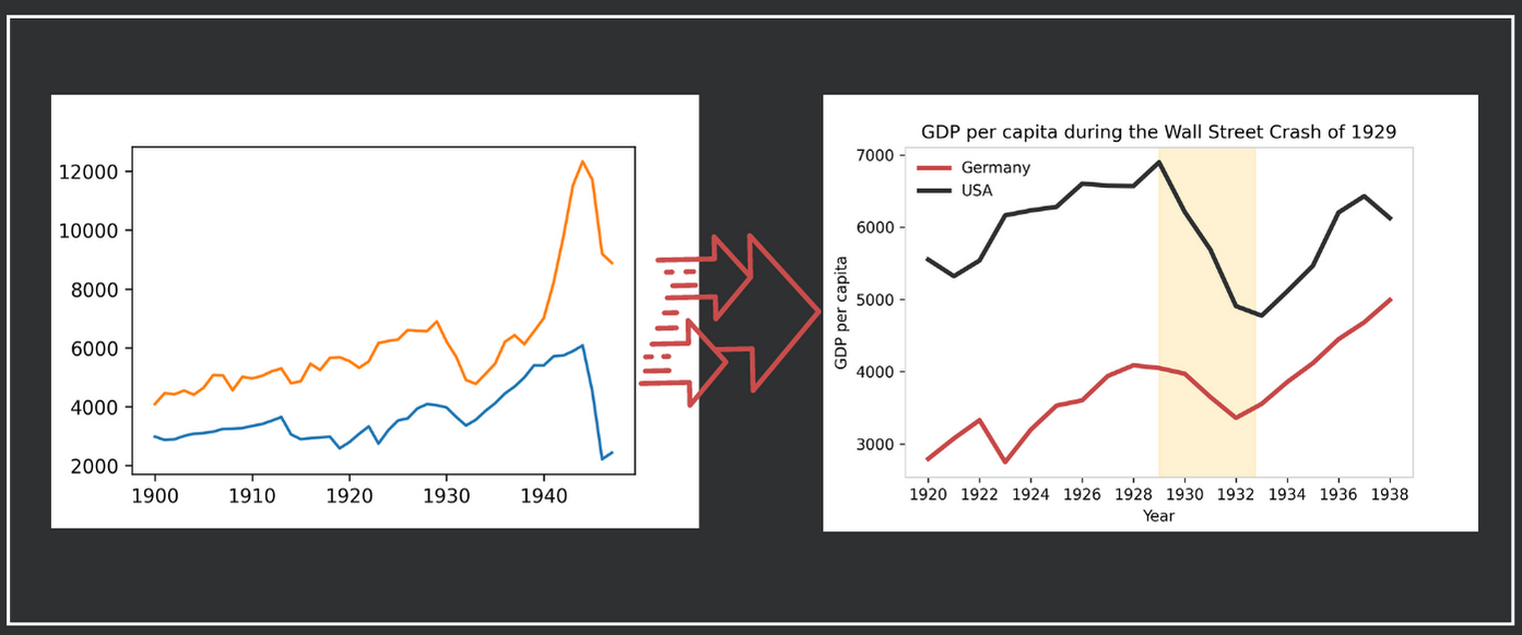
Dive into this guide to create effective visualizations using Matplotlib, and journey through the GDP per capita trends of Germany and the USA during the pivotal 1929 crisis. Check out in the figure below how you will transform a basic plot into an informative and compelling visualization. Let’s get started!
If you would like to know more about the 1929 crisis, check this out.
Data source
Data used in this lesson is available at Harvard Business School
Coding the past: beautiful visualizations with Matplotlib
1. Matplotlib subplots
Matplotlib is a Python library aimed at creating visualizations. It has a good interface with pandas dataframes, which makes it very practical to use. Matplotlib is the base library for other visualization libraries, like Seaborn.
Before diving in, keep in mind these concepts:
- Class: Think of it as a blueprint for creating objects.
- Object: An instance of a class; for visualization, this could be a specific plot.
- Method: A function that operates on an object’s data.
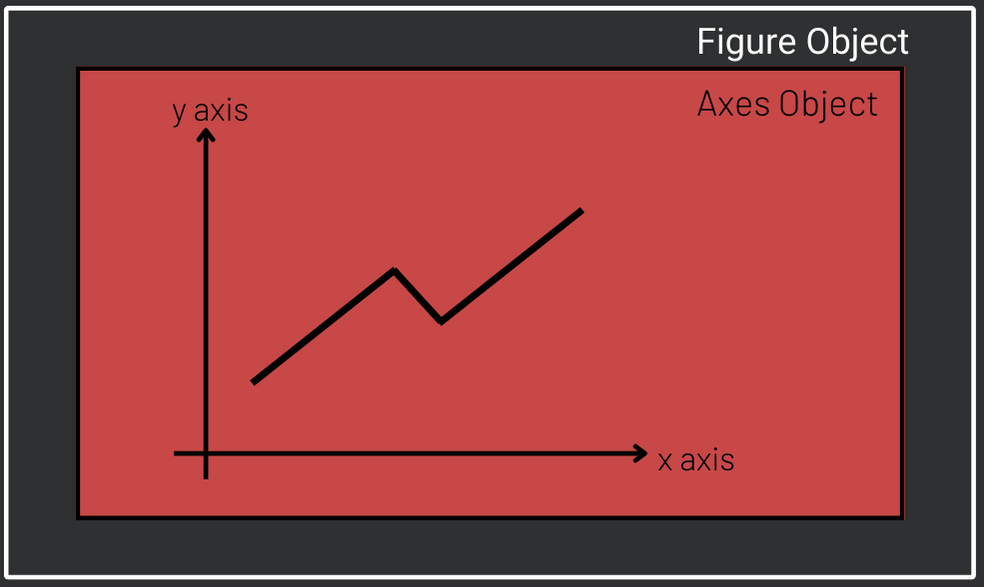
There are many ways you can use Matplotlib, but in order to be able to customize your plot, it is recommended to use the Matplotlib subplots() method. It creates two objects: one object of the class Figure, usually called fig and one object of the class Axes, usually called ax. The former is a sort of container where your plot will be created. The latter is the plot itself. Note that the Axes object is contained in the Figure object. Refer to the Matplotlib documentation for further details.
2. Loading the data with read_csv
Download the data file here. To read the data, use the pandas method pd.read_csv(), which takes 3 parameters. The first is the file path. The second is index_col and it tells pandas which column should be the index of the data frame. Finally, parse_dates set to True converts the index into date format. In the code below, data is loaded and one dataframe is created for each country with the pandas method loc.
content_copy Copy
import pandas as pd

data_path = "/content/drive/MyDrive/historical_data/gdp_prepared.csv"

df = pd.read_csv(data_path,
                 index_col = 0,
                 parse_dates = True)

ger = df.loc[df["country"] == "Germany"]
usa = df.loc[df["country"] == "United States of America"]
2. Matplotlib basic plot
Although in this lesson our fig object will have only one plot, it might have more. Most of the customization will be made through ax methods. To start we will call the ax method plot() twice to create our plots. Note that plot()’s first argument contains the dates and is plotted on the x axis while the second, containing the GDP, is plotted on the y axis. Finally, we show the plot.
content_copy Copy
import matplotlib.pyplot as plt

fig, ax = plt.subplots()
ax.plot(ger.index, ger["gdp_pc"])
ax.plot(usa.index, usa["gdp_pc"])
plt.show()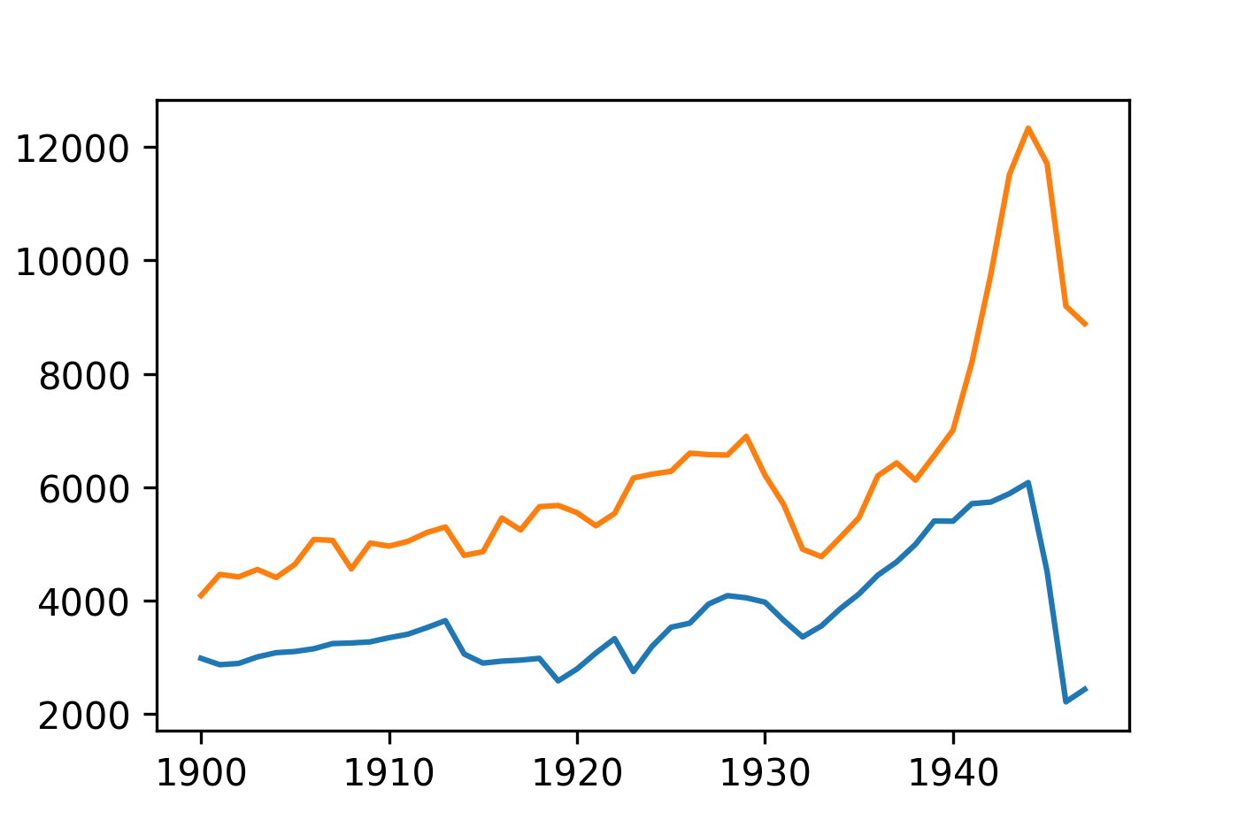
3. Restricting time span
One important aspect to consider when you tell a story with a plot is what you would like to highlight. In this plot, we want to highlight the effect of the 1929 crisis on GDP per capita rather than the effect of the Second or First World War. Thus, let us restrict our time span to the period 1920/1938. Note that when your index is a date you can use pandas loc to specify a certain period of the data:
content_copy Copy
ger = ger.loc["1920-01-01":"1938-01-01"]
usa = usa.loc["1920-01-01":"1938-01-01"]
fig, ax = plt.subplots()
ax.plot(ger.index, ger["gdp_pc"])
ax.plot(usa.index, usa["gdp_pc"])
plt.show()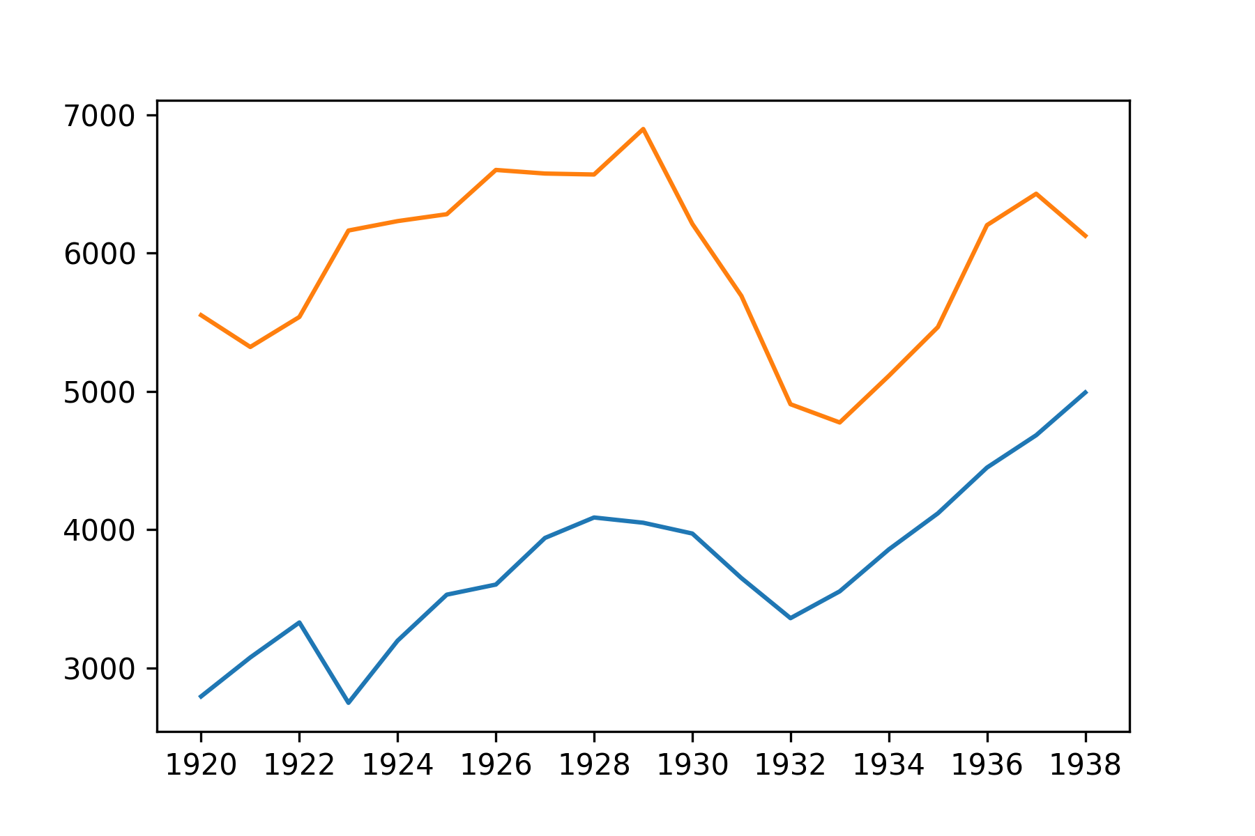
4. Adding a Matplotlib legend
To add a legend, first you have to label each of the line plots and then call the legend() method of ax. Quite intuitive, right?
content_copy Copy
fig, ax = plt.subplots()
ax.plot(ger.index, ger["gdp_pc"],
label = "Germany")
ax.plot(usa.index, usa["gdp_pc"], label = "USA")
ax.legend()
plt.show()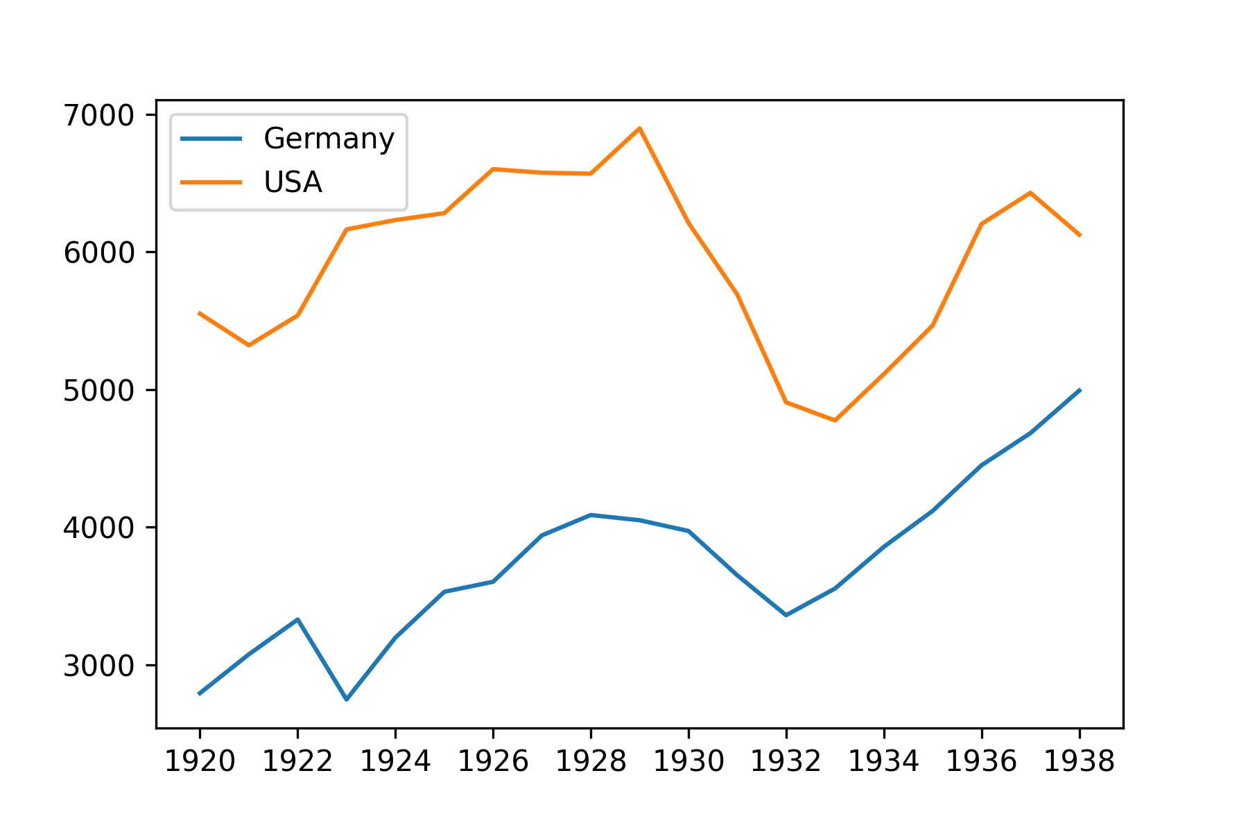
5. Adding a title and and labels to matplotlib axes
There are three methods of ax to set title and labels. They start with set followed by the title or label they set: set_xlabel, set_ylabel, set_title.
content_copy Copy
fig, ax = plt.subplots()
ax.plot(ger.index,
        ger["gdp_pc"],
        label = "Germany")
ax.plot(usa.index,
        usa["gdp_pc"],
        label = "USA")
ax.legend()
ax.set_xlabel("Year")
ax.set_ylabel("GDP per capita")
ax.set_title("GDP per capita during the Wall Street Crash of 1929")
plt.show()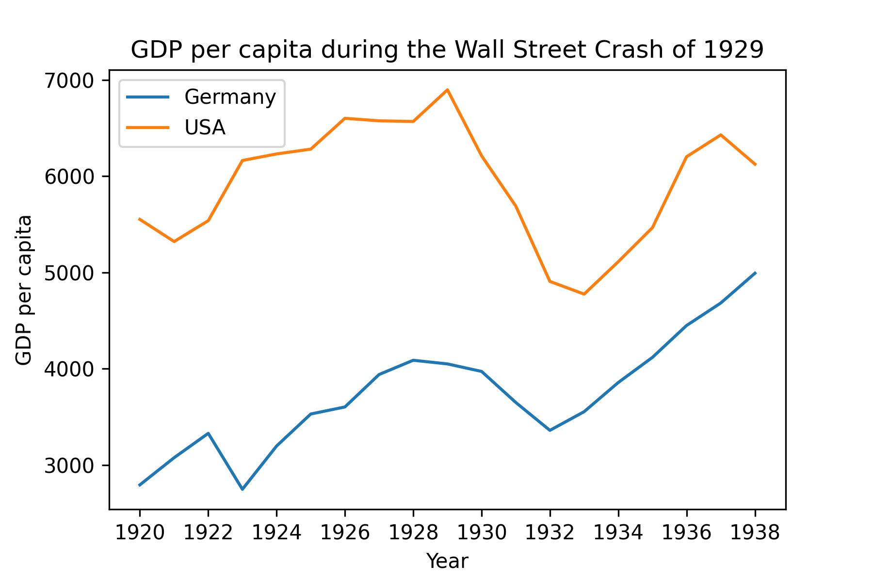
6. Changing line colors
One way of creating your own color palette is with a Python list containing the colors you would like to use. This page has smart recommendations on the use of colors. In this case, a diverging color was chosen to distinguish between the two countries. Color is an argument of plot() and colors are selected by the list index.
content_copy Copy
my_palette = ["#C84848", "#2E3031", "#FEE090", "#d3d3d3"]

fig, ax = plt.subplots()
ax.plot(ger.index,
        ger["gdp_pc"],
        label = "Germany",
        color = my_palette[0])
ax.plot(usa.index,
        usa["gdp_pc"],
        label = "USA",
        color = my_palette[1])
ax.legend()
ax.set_xlabel("Year")
ax.set_ylabel("GDP per capita")
ax.set_title("GDP per capita during the Wall Street Crash of 1929")
plt.show()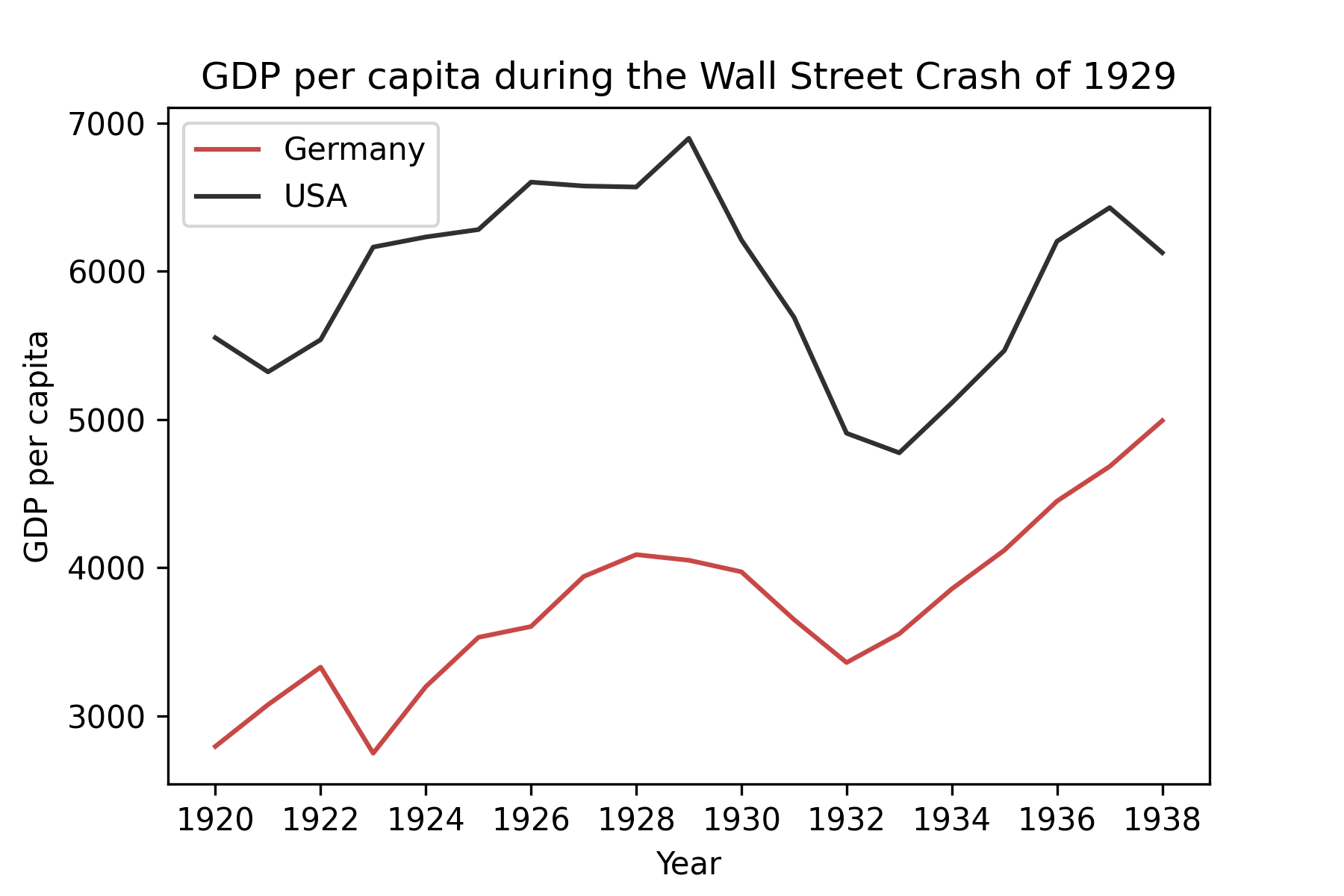
7. Highligthing areas and elements with axvspan
In this step, we start by increasing the line width of both trends to 3. After that, we would like to highlight the period of crisis. For that we use the method axvspan(xmin, xmax, ymin=0, ymax=1, ...) in which we specify the start and end date of the desired period. The y axis is not specified because, by default, the highlighted area goes from zero to the maximum value of y. alpha adds a degree of transparency to the region highlighted.
content_copy Copy
my_palette = ["#C84848", "#2E3031", "#FEE090", "#d3d3d3"]

fig, ax = plt.subplots()
ax.plot(ger.index,
        ger["gdp_pc"],
        label = "Germany",
        color = my_palette[0],
        linewidth = 3)
ax.plot(usa.index,
        usa["gdp_pc"],
        label = "USA",
        color = my_palette[1],
        linewidth = 3)
ax.legend()
ax.set_xlabel("Year")
ax.set_ylabel("GDP per capita")
ax.set_title("GDP per capita during the Wall Street Crash of 1929")
ax.axvspan(pd.Timestamp("1929-01-01"),
           pd.Timestamp("1932-10-01"),
           color = my_palette[2],
           alpha=.4)
plt.show()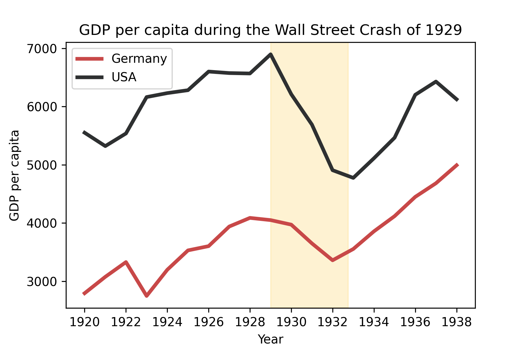
8. Eliminating the frame of matplotlib legend
Edward Tufte, an expert in the field of data visualization, introduced the concept of data-ink ratio in the book The Visual Display of Quantitative Information. Data-ink ratio is the proportion of ink in a plot used to display non-redundant data. The author recommends maximizing this ratio as much as possible to make your plot clearer and to avoid distracting your reader.
In order to improve our data-ink ratio, we will eliminate the legend frame. This can be done by setting framon parameter to false inside the legend() method.
The frame around the plot is made by objects of the class Spine. Print ax.spines and note that you have 4 spines (left, right, bottom, top). It would be nice to have this frame in a lighter color so that it does not call so much attention. This can be done by the set_edgecolor() method . To set all of them to the same color, we can iterate them in ax.spines.values() and set one by one to light gray:
content_copy Copy
my_palette = ["#C84848", "#2E3031", "#FEE090", "#d3d3d3"]

fig, ax = plt.subplots()
ax.plot(ger.index,
        ger["gdp_pc"],
        label = "Germany",
        color = my_palette[0],
        linewidth = 3)
ax.plot(usa.index,
        usa["gdp_pc"],
        label = "USA",
        color = my_palette[1],
        linewidth = 3)
ax.legend(frameon = False)
ax.set_xlabel("Year")
ax.set_ylabel("GDP per capita")
ax.set_title("GDP per capita during the Wall Street Crash of 1929")
ax.axvspan(pd.Timestamp("1929-01-01"),
           pd.Timestamp("1932-10-01"),
           color = my_palette[2],
           alpha=.4)

for spine in ax.spines.values():
    spine.set_edgecolor(my_palette[3])

plt.show()
Found this guide helpful? Have suggestions or questions? Leave a comment below and join the discussion!
Conclusions
- To customize your plot, use Matplotlib method
subplots(); Subplots()creates two objects: one of the class Figure, usually called fig and one of the class Axes, usually called ax;- Use Axes methods to shape your plot according to your needs.
Comments
There are currently no comments on this article, be the first to add one below
Add a Comment
If you are looking for a response to your comment, either leave your email address or check back on this page periodically.