Learn To Use scale_color_brewer To Change Colors In ggplot2
What you will learn
- Learn to improve your plots with scale_color_brewer;
- Become comfortable using scale_color_brewer in a hands-on application
Table of Contents
- 1. What is scale_color_brewer?
- 2. How to use scale_color_brewer?
- 3. Using scale_color_brewer with real data
- 4. Adding a theme to the plot
R offers several libraries created by professional designers that provide excellent color palettes. In this lesson, you will learn to use scale_color_brewer to improve your plots with professional looking colors. To make things more interesting, we’ll use data from the military expenses of leading capitalist countries during the Cold War era. Let’s paint your data story!
1. What is scale_color_brewer?
Simply put, scale_color_brewer is a ggplot2 layer that you can use to easily select the colors of your ggplot visualizations. It makes use of color schemes from ColorBrewer to provide professional sequential, diverging and qualitative palettes.
2. How to use scale_color_brewer?
If you load ggplot2, scale_color_brewer will be available for you and, since ggplot also loads the scales package, a series of ColorBrewer palettes will also be automatically loaded. Therefore all you need to do is adding a new layer to your plot specifying the palette you would like to use. For example, ggplot(...)+ scale_color_brewer(palette = 'Set1'). Check the example below for more color palettes.
3. Using scale_color_brewer with real data
Data used in this example is available on the World Bank website. We will be analysing military expenses of countries during the Cold War era, expressed in percentage of their GDP. To make it easier, a file with the data was prepared for you.
Download the data file here and load the libraries we will need, according to the code below. To read the data, use the R function read_csv(). Additionally, we are only interested in the first five rows and in columns 3 and 5 to 36. They are selected with [1:5, c(3, 5:36)].
content_copy Copy
library(readr)
library(tidyr)
library(dplyr)
library(ggplot2)


military <- read_csv('military.csv')[1:5, c(3, 5:36)]
If you take a look at the dataframe you just loaded, you will see that it has one column for each year. To use ggplot your data has to be tidy. According to Hadley Wickham, in a tidy dataframe:
- Each variable must have its own column;
- Each observation must have its own row;
- Each value must have its own cell;
To make our data tidy, we will transform all the year columns into one variable called “year” and we will also transfer the values contained in these columns to a single new variable called “expense”. Note the syntax of the pivot_longer function. The first argument is the dataframe we want to transform, the second are the columns we would like to treat. Finally, names_to indicates the name of the new column that will receive the years and values_to indicates the name of the new column that will receive the values of the year columns.

Illustration created by the Author
The mutate function makes two adjustments in the new long dataset. First, it eliminates the second part of the year names, e.g., [YR1960]. Second, it rounds the expenses values to two decimal places.
Finally, we change the names of the columns (variables) in our dataset.
content_copy Copy
military_long <- pivot_longer(military,
                              '1960 [YR1960]':'1991 [YR1991]',
                              names_to = 'year',
                              values_to = 'expense') %>%
  mutate(year = substr(year, 1, 4), expense = round(expense, 2))

names(military_long) <- c('country', 'year', 'expense')
Finally, we can plot the trend of military expenses over time using ggplot. The palette Set1 will be used in this example. To set it, add the layer scale_color_brewer(palette = 'Set1'). Note that we also set the x-axis to have labels every 4 years with scale_x_discrete(breaks = seq(1960, 1990, by=4)). Color and group aesthetics were mapped to countries so that each country has a different color.
content_copy Copy
ggplot(data = military_long, aes(x = year, y = expense, group = country, color = country))+
  geom_line(size = 1)+
  scale_x_discrete(breaks = seq(1960, 1990, by=4))+
  scale_color_brewer(palette = 'Set1')+
  xlab('Year')+
  ylab('Military expenditure (% of GDP)')+
  ggtitle('Military Expenses of the Main Capitalist Economies',
          subtitle = '1960 - 1991')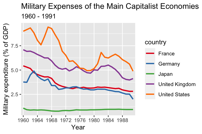
As mentioned above, scale_color_brewer employs ColorBrewer palettes. These are originally available from the RColorBrewer package, but are also automatically loaded by ggplot2. However, to see all the color palettes RColorBrewer offers, you will have to install the package and use the code as follows.
content_copy Copy
library(RColorBrewer)

# Displays the colors visually
par(mar=c(3,4,2,2))
display.brewer.all()

# Get information about all available palettes
brewer.pal.info

# Get hexa codes for a specific palette
brewer.pal(n = 8, name = "Dark2")
Below you can explore the available palettes by clicking on the type of your interest:
Diverging Palettes
| BrBG | |
| PiYG | |
| PRGn | |
| PuOr | |
| RdBu | |
| RdGy | |
| RdYlBu | |
| RdYlGn | |
| Spectral |
Qualitative Palettes
| Accent | |
| Dark2 | |
| Paired | |
| Pastel1 | |
| Pastel2 | |
| Set1 | |
| Set2 | |
| Set3 |
Sequential Palettes
| Blues | |
| BuGn | |
| BuPu | |
| GnBu | |
| Greens | |
| Greys | |
| Oranges | |
| OrRd | |
| PuBu | |
| PuBuGn | |
| PuRd | |
| Purples | |
| RdPu | |
| Reds | |
| YlGn | |
| YlGnBu | |
| YlOrBr | |
| YlOrRd |
4. Adding a theme to the plot
To customize our plot, we will use the ggplot theme developed in the lesson ‘Climate data visualization’. Small adjustments were made to adapt the theme to this plot. For instance, the legend position was set to be at the bottom of the plot and its title was deleted.
content_copy Copy
ggplot(data = military_long, aes(x = year, y = expense, group = country,color = country))+
geom_line(size = 1)+
scale_x_discrete(breaks = seq(1960, 1990, by=4))+
scale_color_brewer(palette = 'Set1')+
  xlab('Year')+
  ylab('Military expenditure (% of GDP)')+
  ggtitle('Military Expenses of the Main Capitalist Economies',
          subtitle = '1960 - 1991')+
  theme_bw()+
  guides(color = guide_legend(title=''))+
  theme(text=element_text(color = 'white'),
            # Changes panel, plot and legend background to dark gray:
            panel.background = element_rect(fill = '#2E3031'),
            plot.background = element_rect(fill = '#2E3031'),
            legend.background = element_rect(fill='#2E3031'),
            legend.key = element_rect(fill = '#2E3031'),
            # Changes legend texts color to white:
            legend.text =  element_text(color = 'white'),
            legend.title = element_text(color = 'white'),
            # Changes color of plot border to white:
            panel.border = element_rect(color = 'white'),
            # Eliminates grids:
            panel.grid.minor = element_blank(),
            panel.grid.major = element_blank(),
            # Changes color of axis texts to white
            axis.text.x = element_text(color = 'white'),
            axis.text.y = element_text(color = 'white'),
            axis.title.x = element_text(color= 'white'),
            axis.title.y = element_text(color= 'white'),
            # Changes axis ticks color to white
            axis.ticks.y = element_line(color = 'white'),
            axis.ticks.x = element_line(color = 'white'),
            legend.position = "bottom")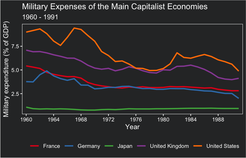
Feel free to test other color palettes and check the one you like the most! Please, leave your opinion or question below and have a great time coding!
Conclusions
scale_color_breweroffers an effective and straightforward method to apply a color palette inggplot2;- Using appropriate color palettes is essential to plot an informing and beautiful visualization.
Comments
There are currently no comments on this article, be the first to add one below
Add a Comment
If you are looking for a response to your comment, either leave your email address or check back on this page periodically.