How to calculate and visualize Z scores in R
What you will learn
- Learn the definition of Z score;
- Be able to calculate and visualize Z scores in R;
- Be confident in interpreting Z scores.
Table of Contents
Introduction
“We don’t need no education.”
Pink Floyd
In this lesson we will use data of the General Social Survey (1972-1978) to study American society in the seventies. In particular, we would like to study schooling duration for individuals in our sample and how specific observations compare to the rest of the sample. To do so, we will use the Z score - a measure of how many standard deviations below or above the population mean an observation is.
Data source
Data used in this lesson is included in the R Survival Package and was originally used in Logan (1983) - A Multivariate Model for Mobility Tables. The data is part of the General Social Survey (1972-1978).
Coding the past: Z score in R
1. What is the Z score?
The Z score is a measure of how many standard deviations a data point in a set is away from the mean of that set of values. Below you find the expression to calculate the Z score of a given point in a sample.
\[Z_{X} = \frac{X - \overline{X}}{S}\]Where:
- \(Z_{X}\) is the Z score of the point \(X\);
- \(X\) is the value for which we want to calculate the Z score;
- \(\overline{X}\) is the mean of the sample;
- \(S\) is the standard deviation of the sample.
2. Calculating Z score in R
Implementing the Z score formula in R is quite straightforward. To reuse code, we will create a function called calculate_z using the mean and sd base functions to calculate Z. sd calculates the standard deviation in R.
content_copy Copy
calculate_z <- function(X, X_mean, S){
  return((X-X_mean)/S)
}
To load the data, we will use the data function and specify the survival package. The dataset we are interested in is called logan and contains information about the duration of education for 838 individuals. The variable education contains the number of years of schooling for each individual.
content_copy Copy
library(survival)

data(logan, package="survival")

mean(logan$education)

sd(logan$education)
The average education duration in our sample is 13.58 years, with a standard deviation of 2.73 years. With this information, we can proceed to calculate the Z score for each observation in the dataset.
content_copy Copy
logan$z_score <- calculate_z(logan$education,
                             mean(logan$education, na.rm = TRUE),
                             sd(logan$education, na.rm = TRUE))

head(logan, 5)| occupation | focc | education | race | z_score |
|---|---|---|---|---|
| sales | professional | 4 | non-black | 0.15 |
| craftsmen | sales | 13 | non-black | -0.21 |
| sales | professional | 16 | non-black | 0.89 |
| craftsmen | sales | 16 | non-black | 0.89 |
| operatives | professional | 14 | non-black | 0.15 |
As you can see in the dataframe, the first individual spent 0.15 standard deviations more time in school compared to the average. A negative Z score indicates that the observation is below the average, while a positive Z score indicates that it is above the average.
Use summary(logan$z_score) to check the Z score summary statistics. You will observe that the individual with the shortest education duration in our dataset has a schooling period that is 4.23 standard deviations below the mean. Conversely, the individual with the longest schooling duration is 2.35 standard deviations above the average.
3. Visualizing Z scores in a histogram
One way to visually represent our data is by using a histogram. It shows how often each different value occurs. The x-axis represents the variable values, while the y-axis represents the count of occurrences for each value in our sample.
You can plot a histogram in ggplot2 with the geom layer called geom_histogram(). It has the argument bins where you can pass the number of intervals you would like to divide your data, that is, how many bars you will have.
In the plot below, the white dashed lines indicate the interval of two standard deviations (Z=+/-2) around the mean. Similarly, the yellow dashed lines represent the interval of three standard deviations (Z=+/-3) around the mean. These lines are added with the geom_vline() function.
To customize our plot, we will use the ggplot theme developed in the lesson ‘Climate data visualization’.
content_copy Copy
library(ggplot2)
theme_coding_the_past <- function() {
  theme_bw()+
  theme(# Changes panel, plot and legend background to dark gray:
        panel.background = element_rect(fill = '#2E3031'),
        plot.background = element_rect(fill = '#2E3031'),
        legend.background = element_rect(fill="#2E3031"),
        # Changes legend texts color to white:
        legend.text =  element_text(color = "white"),
        legend.title = element_text(color = "white"),
        # Changes color of plot border to white:
        panel.border = element_rect(color = "white"),
        # Eliminates grids:
        panel.grid.minor = element_blank(),
        panel.grid.major = element_blank(),
        # Changes color of axis texts to white
        axis.text.x = element_text(color = "white"),
        axis.text.y = element_text(color = "white"),
        axis.title.x = element_text(color="white"),
        axis.title.y = element_text(color="white"),
        # Changes axis ticks color to white
        axis.ticks.y = element_line(color = "white"),
        axis.ticks.x = element_line(color = "white")
  )
}

mean_edu <- mean(logan$education, na.rm = TRUE)
sd_edu   <- sd(logan$education, na.rm = TRUE)


ggplot(data = logan, aes(x = education))+
  geom_histogram(fill = "#FF6885",
                color = "#FF6885",
                alpha = 0.6,
                bins = 15)+
  ylab("Count")+
  xlab("Years of education")+
  geom_vline(xintercept = mean_edu + 2*sd_edu,
             color = "white",
             linetype = "dashed")+
  geom_vline(xintercept = mean_edu - 2*sd_edu,
             color = "white",
             linetype = "dashed")+
  geom_vline(xintercept = mean_edu + 3*sd_edu,
             color = "#feb24c",
             linetype = "dashed")+
  geom_vline(xintercept = mean_edu - 3*sd_edu,
             color = "#feb24c",
             linetype = "dashed")+
  annotate("text", x = 4.5,  y = 100,
            label = "Z=-3", color = "#feb24c")+
  annotate("text", x = 21,   y = 100,
            label = "Z=3",  color = "#feb24c")+
  annotate("text", x = 7.3,  y = 100,
            label = "Z=-2", color = "white")+
  annotate("text", x = 18.3, y = 100,
            label = "Z=2",  color = "white")+
  theme_coding_the_past()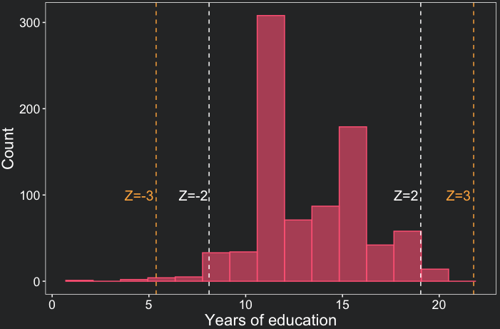
One remarkable conclusion we draw from the plot above is that the majority of data points fall within a range of up to two standard deviations from the mean. In fact, only 4.4% of our observations exceed this threshold of two standard deviations. Note as well that there are 15 bars in the histogram, which is the number of bins we specified in the geom_histogram() function.
4. Skewness of the distribution
Skewness refers to the asymmetry of a distribution. The distribution of education duration is skewed to the left. This means there are more individuals with a very low education duration compared to those with a very large duration. This can also be seen by the minimum and maximum Z score. While the minimum is -4.23, the maximum is only 2.35. Extreme Z-scores are also indicators of outliers, that is, values unusually high or low compared to most of the observations.
In the next lesson, we will explore a specific type of distribution known as the normal distribution. This distribution is symmetric and has certain properties that make it easier to analyze.
Conclusions
- The Z score is a measure of how many standard deviations a data point is away from the mean. It can be easily calculated in R;
- ggplot2 can be used to visualize the different Z scores in a distribution;
- Extreme Z-scores might indicate outliers or skewed distributions;
Comments
There are currently no comments on this article, be the first to add one below
Add a Comment
If you are looking for a response to your comment, either leave your email address or check back on this page periodically.