Uncovering History with R - A Look at the HistData Package
What you will learn
- Understand the R HistData package, its various datasets, and how these datasets can enrich your research in the humanities and social sciences;
- Be able to load datasets and explore summary statistics;
- Be confident in visualizing relations and quantities with HistData and ggplot2;
- Explore the Nightingale dataset and replicate a historical visualization using ggplot2.
Table of Contents
Introduction
“Historians offer us systems of the past that are too complete, series of causes and effects that are too exact and too clear to have ever been entirely true.”
Marguerite Yourcenar - Mémoires d`Hadrien (1974)
Greetings, humanists, social and data scientists! Are you curious about how data analysis can enrich your research and understanding? Look no further! Today, we explore the world of historical data analysis using R’s powerful package: HistData. This package contains a collection of more than 30 datasets that can be used to explore historical trends and patterns.
Data source
HistData is an R package that provides a collection of 31 small datasets that are part of a program of research known as statistical historiography, that is, “the use of statistical methods to study problems and questions in the history of statistics and graphics” (Friendly, 2021). They can, of course, be used to study other topics in the humanities and social sciences. Thank you to the authors Michael Friendly, Stephane Dray, Hadley Wickham, James Hanley, Dennis Murphy, Peter Li for this wonderful compilation of datasets! Here are some of the data included.
| Dataset | Description |
|---|---|
| Arbuthnot | Arbuthnot’s data on male and female birth ratios in London from 1629-1710 |
| Armada | The Spanish Armada |
| Bowley | Bowley’s data on values of British and Irish trade, 1855-1899 |
| Cavendish | Cavendish’s 1798 determinations of the density of the earth |
| ChestSizes | Quetelet’s data on chest measurements of Scottish militiamen |
| Cholera | William Farr’s Data on Cholera in London, 1849 |
| CushnyPeebles | Cushny-Peebles data: Soporific effects of scopolamine derivatives |
| Dactyl | Edgeworth’s counts of dactyls in Virgil’s Aeneid |
| DrinksWages | Elderton and Pearson’s (1910) data on drinking and wages |
| Fingerprints | Waite’s data on Patterns in Fingerprints |
| Galton | Galton’s data on the heights of parents and their children |
| GaltonFamilies | Galton’s data on the heights of parents and their children, by family |
| Guerry | Data from A.-M. Guerry, "Essay on the Moral Statistics of France" |
| HalleyLifeTable | Halley’s Life Table |
| Jevons | W. Stanley Jevons’ data on numerical discrimination |
Coding the past: exploring HistData
1. How to install the package in R?
To get started with HistData, you will first need to install and load the package into your R environment. We will additionally load other necessary libraries. You can do this using the following commands:
content_copy Copy
install.packages("HistData")

library(HistData)
library(dplyr)
library(ggplot2)
library(tidyr)
You can access descriptions for each dataset using the help(DataSet) command. Moreover, running example(DataSet) will, in most cases, demonstrate applications similar to their historical use.
2. How to load and rename a dataset from HistData?
To demonstrate HistData’s capabilities, we will use the Nightingale dataset. This dataset contains the monthly number of deaths from various causes in the British Army during the Crimean War (1853-1856). The data was collected by Florence Nightingale, a British nurse who became famous for her work in the Crimean War. She was also a pioneer in the use of data visualization to communicate information.
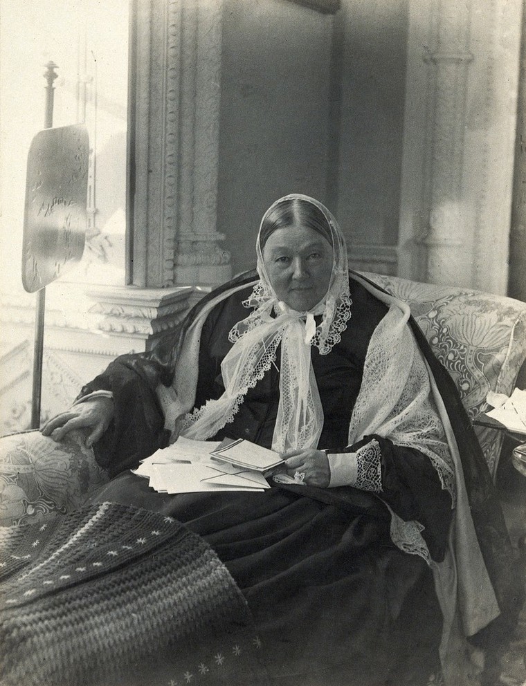 Florence Nightingale. Photograph by Millbourn. Wellcome Collection. Public Domain
To load the Nightingale dataset, we use the data() function. It will be automatically named Nightingale in our environment. However, we can load it into a dataframe with a different name, such as df, using the following command:
content_copy Copy
data(Nightingale)
df <- Nightingale
To check the structure of the dataset, use the str(Nightingale). This will show you the number of observations and variables, as well as the type of data in each column. You will see that the dataset has 10 variables: Date, Month, Year, Army, Disease, Wounds, Other, Disease.rate, Wounds.rate, and Other.rate. There are 24 observations for each variable. We will focus on the following variables:
Date: the date of the observation;Year: the year of the observation;Disease: the number of deaths from preventable or mitigable zymotic diseases;Wounds: the number of deaths directly from battle wounds;Other: the number of deaths from other causes.
3. Explore the dataset
First, let’s create a new variable Total with the total amount of deaths per period. We can do this by adding the Disease, Wounds, and Other variables. This is done with the mutate() function available in the dplyr package. We can then use the group_by() and summarise() functions to calculate the average number of deaths per year.
content_copy Copy
df <- mutate(df, Total = Disease + Wounds + Other)

df %>% group_by(Year) %>%
  summarise(average_n_deaths = mean(Total))
We can see that the average number of deaths was 688 in 1854; reached a peak of 967 deaths in 1855; and decreased in 1856.
To visualize the trend of deaths over time, we can use geom_line() function from the ggplot2 package. The Date variable should be mapped to the x-axis and the Total variable to the y-axis. We can use the labs() function to add a title and labels to the x and y axes. Note that theme_coding_the_past() is a custom theme that I created in the lesson ‘Climate data visualization’ to make the plot match the blog theme. You can use the default theme or create your own.
content_copy Copy
theme_coding_the_past <- function() {
  theme_bw()+
    theme(# Changes panel, plot and legend background to dark gray:
      panel.background = element_rect(fill = '#2E3031'),
      plot.background = element_rect(fill = '#2E3031'),
      legend.background = element_rect(fill="#2E3031"),
      legend.key = element_rect(fill = '#2E3031'),
      plot.title = element_text(color = "white"),
      # Changes legend texts color to white:
      legend.text =  element_text(colour = "white"),
      legend.title = element_text(colour = "white"),
      # Changes color of plot border to white:
      panel.border = element_rect(color = "white"),
      # Eliminates grids:
      panel.grid.minor = element_blank(),
      panel.grid.major = element_blank(),
      # Changes color of axis texts to white
      axis.text.x = element_text(colour = "white"),
      axis.text.y = element_text(colour = "white"),
      axis.title.x = element_text(colour="white"),
      axis.title.y = element_text(colour="white"),
      # Changes axis ticks color to white
      axis.ticks.y = element_line(color = "white"),
      axis.ticks.x = element_line(color = "white")
    )
}

ggplot(df, aes(x = Date, y = Total))+
  geom_line(color = "#FF6885", size = 1)+
  labs(title = "Deaths in the British Army during the Crimean War",
       x = "Date",
       y = "Total Number of Deaths")+
  theme_coding_the_past()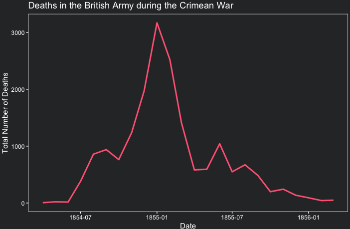
Florence Nightingale hypothesized that deaths in war hospitals were more frequently caused by poor sanitary conditions than by the war injuries themselves. As a result of Nightingale’s reports and persistent advocacy, a Sanitary Commission was dispatched in March 1855 to enhance hygiene standards, improve ventilation, and introduce preventive measures such as handwashing. To evaluate whether the death rates declined following the arrival of the Sanitary Commission, Florence took a progressive approach for her time. She analyzed and visualized data!
4. Florence’s approach: a Coxcomb chart
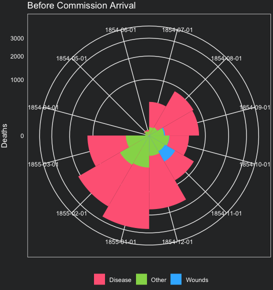
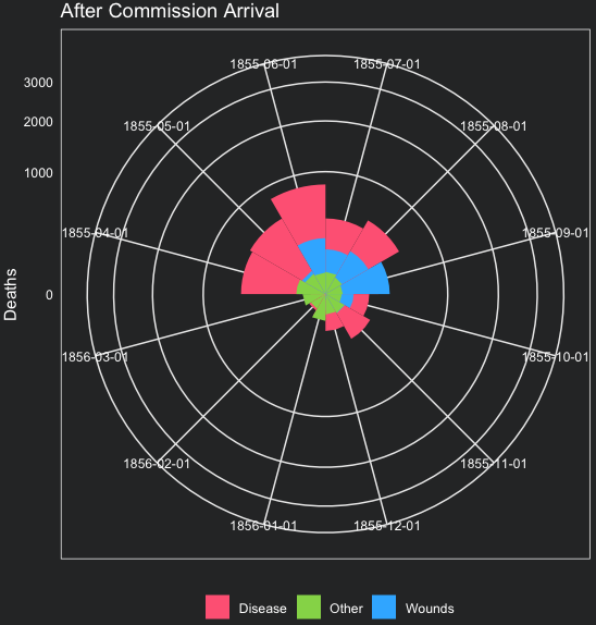
To better understand how the number of deaths evolved during the war period, Florence utilized a Coxcomb plot. This plot is similar to a pie chart, but all sectors have equal angles, differing in how far they extend from the center of the circle.
The figure below presents the Coxcomb plot that Florence created. The plot illustrates the number of deaths per month and cause. The radius of each sector is proportional to the number of deaths. There are 12 sectors, each representing a month of the year, starting from the left (April 1854) and proceeding in a clockwise direction until March 1855, thus completing the circle. Each sector is further divided by color, indicating the cause of death. Florence split the data into two different visualizations: one for before the arrival of the Sanitary Commission (plot on the right), and one for after (plot on the left).
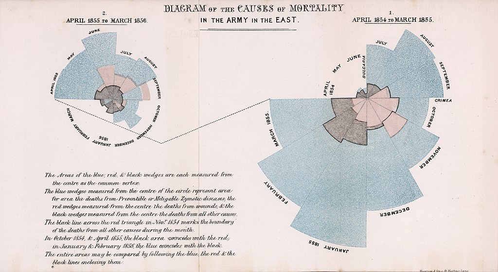
Florence Nightingale, Public domain, via Wikimedia Commons
In the next sections, we will replicate Nightingale’s Coxcomb plot using the ggplot2 package. Before that, we will use the pivot_longer() function from the tidyr package to transform the data from a wide to a long format. This will allow us to visualize the trend of deaths by cause over time.
5. How to use R pivot_longer?
The pivot_longer() function, from the tidyr package, enables us to convert our data from a wide format to a long one. This process will create a new variable named Cause with the values Disease, Wounds and Other, all of which were previously separate variables. The death counts corresponding to each cause will now be housed in a new variable labeled Deaths. The cols argument specifies the variables to be transformed, while the names_to and values_to arguments specify the names of the new variables. The figure below illustrates the transformation from wide to long format.
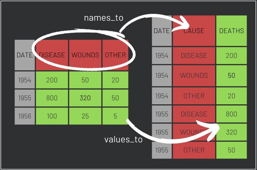
The following code first selects the relevant variables and then carries out the wide to long transformation. Moreover, we create one dataset for the data before the Commission’s arrival and another one for after the arrival. We will use these datasets to replicate Florence’s Coxcomb plot in the next section.
content_copy Copy
df <- df %>%
  select(Date, Disease, Wounds, Other) %>%
  pivot_longer(cols = Disease:Other, names_to = "Cause", values_to = "Deaths")

df_before <- filter(df, Date < as.Date("1855-04-01"))
df_after <- filter(df, Date >= as.Date("1855-04-01"))
6. Replicate Florence’s Coxcomb plot with ggplot2
The code below replicates Nightingale’s Coxcomb plot. Date is mapped to the x-axis and the Deaths to the y-axis. The fill parameter is dependent on Cause. The geom_bar() layer creates a stacked bar chart. The scale_y_sqrt() function transforms the y-axis into a square root scale to better visualize the differences between the number of deaths by cause. Note also that the limits argument guarantees that before and after y-axis will have the same scale: from 0 to 3000 deaths. Thus we can compare the two plots more easily.
Finally, coord_polar() converts the bar chart into a Coxcomb plot. The ´start´ argument sets the offset of starting point from “12 o’clock” in radians. We set it to 3*pi/2 (270°) to start at “9 o’clock” to replicate Florence’s choice. The ggtitle() function adds a title to the plot. The scale_fill_manual() function sets the colors of the sectors. The theme() adapts the plot to fit the style of this page. The exact same plot is created for the data after the arrival of the Sanitary Commission.
content_copy Copy
my_colors <- c("#FF6885", "#95D758", "#38B6FF")

ggplot(df_before, aes(x = as.factor(Date), y = Deaths, fill = Cause)) +
  # Stacked bar chart
  geom_bar(width = 1, position="identity", stat="identity")+
  scale_fill_manual(values = my_colors)+
  # Fixed scale for before and after
  scale_y_sqrt(limits = c(0, 3000))+
  # A coxcomb plot (bar chart + polar coordinates)
  coord_polar(start=3*pi/2) +
  ggtitle("Before Commission Arrival")+
  #theme changes
  theme_bw()+
  theme(# Changes panel, plot and legend background to dark gray:
    panel.background = element_rect(fill = '#2E3031'),
    plot.background = element_rect(fill = '#2E3031'),
    legend.background = element_rect(fill="#2E3031"),
    legend.key = element_rect(fill = '#2E3031'),
    # White plot title
    plot.title = element_text(color = "white"),
    # Changes legend position and texts color
    legend.text =  element_text(colour = "white"),
    legend.title = element_blank(),
    legend.position = "bottom",
    # Changes color of plot border to white:
    panel.border = element_rect(color = "white"),
    # Changes color of axis texts to white
    axis.text.x = element_text(colour = "white"),
    axis.text.y = element_text(colour = "white"),
    # Omits axes titles and ticks
    axis.title.x = element_blank(),
    axis.title.y = element_blank(),
    axis.ticks.y = element_blank(),
    axis.ticks.x = element_blank())
In the plots below, we can confirm that the number of deaths from preventable diseases, in pink, is a lot larger before the arrival of the Sanitary Commission. On the other hand, the number of deaths from wounds and other causes, in blue and green, respectively, is smaller and relatively stable.
7. A line plot instead of a Coxcomb plot
And what if we used a line plot to analyze the same data? The code below employs geom_line to achieve that. Note that geom_vline adds a vertical line at the date of the arrival of the Sanitary Commission.
content_copy Copy
ggplot(df, aes(x = Date, y = Deaths, color = Cause))+
  geom_line(size = 0.8)+
  labs(title = "Deaths in the British Army during the Crimean War",
       x = "Date",
       y = "Number of Deaths")+
  geom_vline(xintercept = as.Date("1855-04-01"), color = "white", linetype = "dashed")+
  scale_fill_manual(values = my_colors)+
  theme_coding_the_past()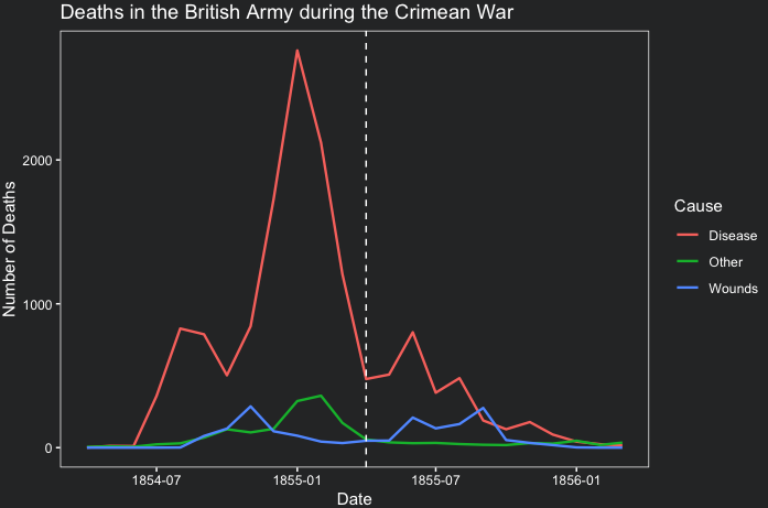
Once again, this plot illustrates that mortality decreased following the arrival of the Sanitary Commission. Notably, deaths from preventable diseases, represented by the pink line, experienced a significant reduction. It’s crucial to bear in mind, however, that before-and-after analyses do not provide definitive proof of causality. Nevertheless, the evidence showcased in both the line plot and the Coxcomb plot strongly indicates that the implemented measures likely drove the observed decrease in fatalities.
What are your thoughts? Do you prefer the Coxcomb plot or the line plot? In your opinion, which visualization is the most effective? I welcome your feedback in the comments below!
Conclusions
HistDatais a package that provides a collection of 31 small datasets that can be used to explore historical trends and patterns;- A Coxcomb chart is similar to a pie chart, but all divisions have equal angles, differing in how far they extend from the center of the circle;
- Different plots can be used to visualize the same data. The choice of visualization depends on the type of data and the message you want to convey.
Comments
There are currently no comments on this article, be the first to add one below
Add a Comment
If you are looking for a response to your comment, either leave your email address or check back on this page periodically.