How to Change Fonts in ggplot2 with Google Fonts
What you will learn
- Be able to enhance your visualizations in R by integrating Google Fonts into ggplot2 graphs;
- Be comfortable with loading and manipulating historical data in R;
- Raise historical hypotheses taking into consideration the plots developed.
Table of Contents
- 1. Data source
- 2. How to load a tsv file in R?
- 3. Using the table function to summarize a categorical variable
- 4. Change fonts in ggplot2 with showtext
- 5. Checking the causes of death
- 6. Conclusions
Greetings, humanists, social and data scientists!
In this lesson, we delve into the world of data visualization with a focus on the use of different fonts in ggplot2. We are going to learn how to take advantage of Google Fonts to enrich our plots. Our journey takes us back in time, exploring a dataset derived from the “London Lives 1690-1800: Crime, Poverty and Social Policy in the Metropolis” project. This dataset provides a window into the socio-economic and health conditions of 18th-century.
Use the app below to check out the fonts you will be able to access after completing this lesson:
If you are interested in how this Shiny App was coded, please, check this GitHub repository.
1. Data source
The data used in this tutorial consists of a catalogue of historical documents organized by Sharon Howard. These documents detail an extensive range of Westminster inquests conducted between 1760 and 1799. They document investigations into deaths under circumstances that were sudden, unexplained, or suspicious.
The data is derived from a larger project, London Lives 1690-1800: Crime, Poverty and Social Policy in the Metropolis, a rich resource shedding light on the lives of ordinary Londoners during this era. The dataset we explore comprises 2,894 inquest records, each containing detailed information such as the dates of the inquests, names of the deceased, the verdicts rendered, and the causes of death. Sharon Howard’s contribution in organizing these records offers an invaluable opportunity to study the social and legal intricacies of historic London.
2. How to load a tsv file in R?
TSV stands for ‘Tab-Separated Values,’ a textual format used to store tabular data. In this lesson, our data is stored in TSV format. To load it, we use the read_tsv function from the readr package. After loading the data, we need to eliminate observations where the verdict is undefined.
Furthermore, the original data categorizes three types of suicide: ‘suicide (delirious)’, ‘suicide (felo de se)’, and ‘suicide (insane)’. However, for our purposes, we will classify all these as simply ‘suicide’. The code below execute these steps. Note that we use filter, mutate and recode from the dplyr package. The recode function takes as argument the column to be recoded and each value associated with its new content. The packages needed for this lesson are called at the beginning of the code. Please install them with install.packages() in case you don’t have them.
content_copy Copy
library(readr)
library(dplyr)
library(ggplot2)
library(showtext)

df <- read_tsv("wa_coroners_inquests_v1-1.tsv")

df_prep <- df %>%
  filter(verdict != "-") %>%
  mutate(verdict = recode(verdict, "suicide (delirious)" = "suicide",
                          "suicide (felo de se)" = "suicide",
                          "suicide (insane)" = "suicide"))
3. Using the table function to summarize a categorical variable
An efficient method for counting the number of each type of verdict in the verdict variable is to use the table function. While this function is typically used to construct a contingency table for two variables, in this instance, it is utilized to tally the frequency of each category within the verdict variable. We then transform this table into a data frame to facilitate its use in ggplot2.
content_copy Copy
table_ver <- data.frame(table(df_prep$verdict))4. Change fonts in ggplot2 with showtext
The showtext package, developed by Yixuan Qiu, greatly simplifies the use of various font types in R plots. In this lesson, we’ll focus on using showtext to access Google Fonts, though the package offers more than just that capability.
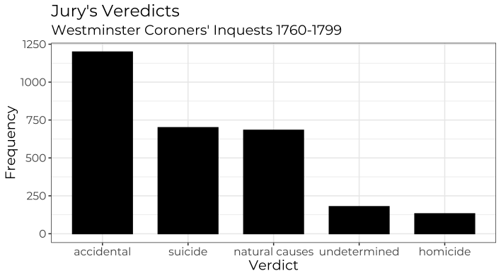
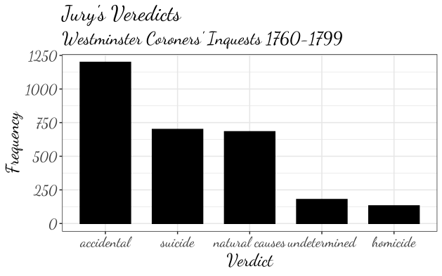
After loading the library, you can select your desired Google Font using the font_add_google function. The showtext_auto command then instructs R to employ showtext for text rendering. That’s it — next, simply specify your chosen font in the ggplot2 theme, as demonstrated in the code below. Since our table_ver data is already aggregated, we need to set stat = “identity” in the geom_bar layer. It’s important to note the use of reorder to arrange the bars from largest to smallest frequency. The figures illustrate the resulting plots, first with the ‘Montserrat’ font followed by the ‘Dancing Script’ font.
content_copy Copy
font_add_google("Montserrat")

showtext_auto()

ggplot(table_ver) +
  geom_bar(aes(x = reorder(Var1, -Freq, sum), y = Freq), stat = "identity", color = "black", fill = "black") +
  labs(title = "Jury's Veredicts",
       y = "Frequency",
       x = "Verdict",
       subtitle = "Westminster Coroners' Inquests 1760-1799")+
  theme_bw()+
  theme(text=element_text(size=14, family="Montserrat"))

The plot above suggests a relatively low number of homicides in these inquests. One could investigate, if indeed the number is so low or if maybe the inquest’s documentation suggest the possibility of homicides being wrongly classified as accidental.
5. Checking the causes of death
In the plots above, we explored the verdict that resulted from the inquests, but the dataset is richer in details. Let us explore a little more?
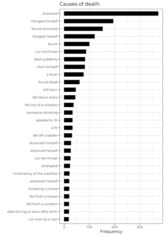
The variable cause_of_death tells us more details of the circumstances in which the person in each inquest died. To visualize the most frequent causes of death, we will start by elimintating NA observations in this variable. We can do that with filter(!is.na()), which filters only values that are not NA. Following that command, we group observations by cause_of_death and count the frequency of each cause with tally.
The last step is to filter only causes of death that occurred more than 15 times in our dataset. Please, decrease this number if you would like to see more causes. Finally, we can use the same ggplot2 code to plot the causes of death. Since the texts representing the causes of death are longer than the verdicts, we will plot the them in the y axis and the frequency in the x axis. The remaining code remains very similar.
content_copy Copy
cause <- df_prep %>%
  filter(!is.na(cause_of_death)) %>%
  group_by(cause_of_death) %>%
  tally() %>%
  filter(n>15)


font_add_google("Montserrat")

showtext_auto()

ggplot(cause) +
  geom_bar(aes(y = reorder(cause_of_death, n, sum), x = n),
           width = .5, stat = "identity",color = "black", fill = "black") +
  labs(title = "Causes of death",
       y = "",
       x = "Frequency")+
  theme_bw() +
  theme(text=element_text(size=10,
                          family = "Montserrat"))
It’s noteworthy that a significant number of the inquests pertained to cases of drowning or suicide. An intriguing avenue for further research would be to delve into the complete reports of these inquests. Such an investigation could shed light on the reasons behind the high incidence of drownings.
Please, feel free to leave any questions or concerns you might have in the comments below.
6. Conclusions
- Using Google Fonts within ggplot2 not only transforms but significantly elevates the aesthetic appeal of our data visualizations;
- Leveraging the showtext package simplifies incorporating diverse Google Fonts into R, enhancing our data representation capabilities;
- Employing simple plots with historical data effectively generates insightful hypotheses, offering a deeper understanding of our past.;
Comments
There are currently no comments on this article, be the first to add one below
Add a Comment
If you are looking for a response to your comment, either leave your email address or check back on this page periodically.