Mastering Violin Plots in ggplot2 with Real Data
What you will learn
- Understand what a violin plot is;
- Be comfortable creating a violin plot with ggplot2;
Table of Contents
- 1. What is a violin plot?
- 2. When should you use a violin plot?
- 3. How to code a ggplot2 violin plot?
- 4. Conclusions
1. What is a violin plot?
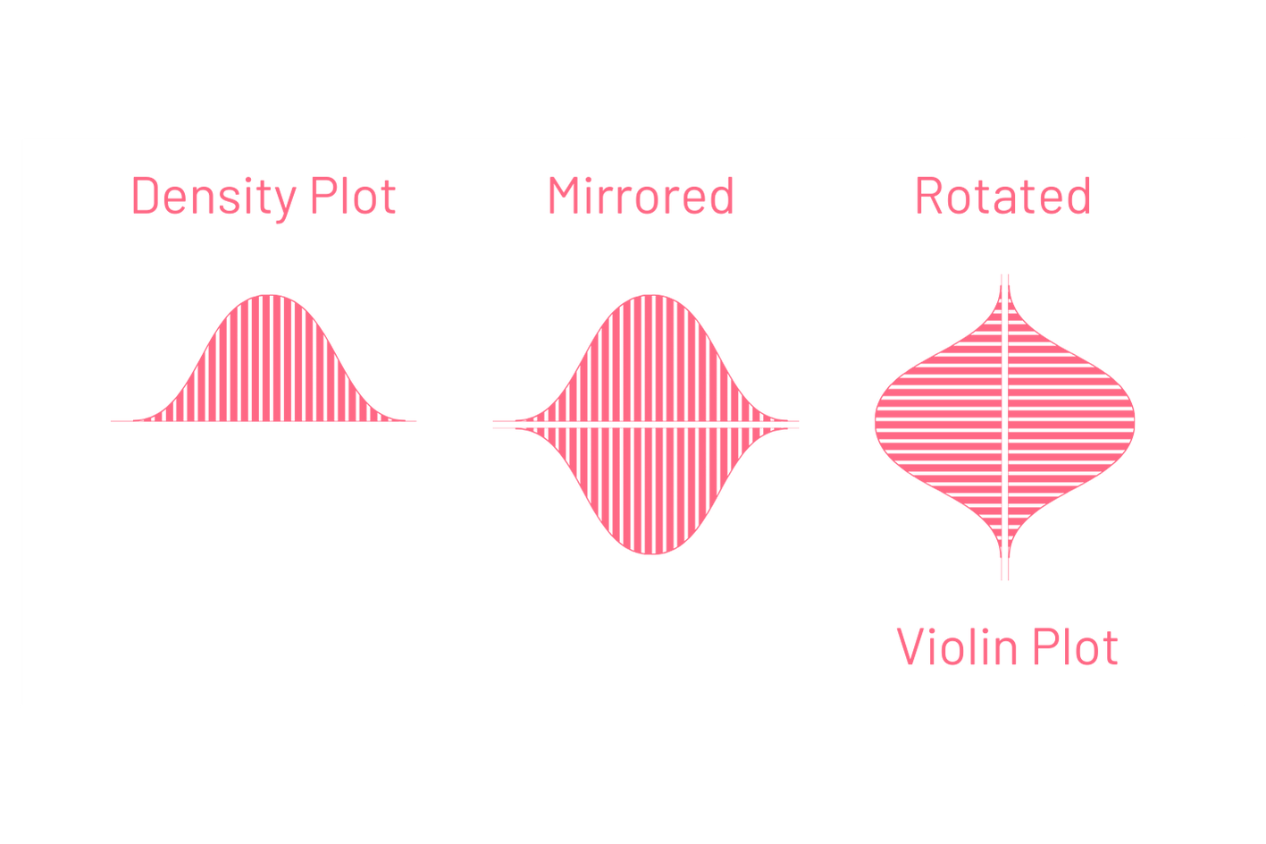
A violin plot is a mirrored density plot that is rotated 90 degrees as shown in the picture. It depicts the distribution of numeric data.
2. When should you use a violin plot?
A violin plot is useful to compare the distribution of a numeric variable across different subgroups in a sample. For instance, the distribution of heights of a group of people could be compared across gender with a violin plot.
3. How to code a ggplot2 violin plot?
First, map the numeric variable whose distribution you would like to analyze to the x position aesthetic in ggplot2. Second, map the variable you want to use to separate your sample in different groups to the y position aesthetic. This is done with aes(x = variable_of_interest, y = dimension) inside the ggplot() function. The last step is to add the geom_violin() layer.
To exemplify these steps, we will examine the capacity of Roman amphitheaters across different regions of the Roman Empire. The data for this comes from the cawd R package, maintained by Professor Sebastian Heath. This package contains several datasets about the Ancient World, including one about the Roman Amphitheaters. To install the package, use devtools::install_github("sfsheath/cawd").
After loading the package, use data() to see the available data frames. We will be using the ramphs dataset. It contains characteristics of the Roman amphitheaters. For this example, we will use the column 2 (title), column 7 (capacity) and column 8 (mod.country), which specifies the modern country where the amphitheater was located. We will also consider only the three modern countries with the largest number of amphitheaters - Tunisia, France or Italy. The code below loads and filters the relevant data.
content_copy Copy
library(cawd)
library(ggplot2)

# Store the dataset in df1
df1 <- ramphs

# Select all rows of relevant columns
df2 <- df1[ ,c(2,7,8)]

# Filter only the rows where modern country is either Tunisia, France or Italy
df3 <- df2[df2$mod.country %in% c("Tunisia", "France", "Italy"), ]

# Delete NAs
df4 <- na.omit(df3)

# Plot a basic ggplot2 violin plot
ggplot(data = df4, aes(x=mod.country, y=capacity))+
  geom_violin()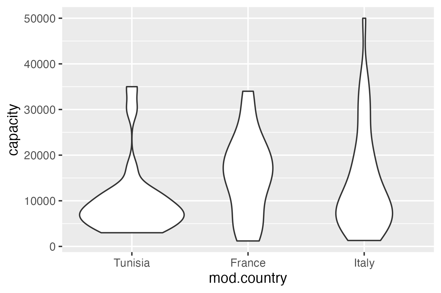
We can further customize this plot to make it look better and fit this page theme. In the code below we improve the following aspects:
geom_violin(color = "#FF6885", fill = "#2E3031", size = 0.9)changes in the color and size of line and fill of the violin plot;geom_jitter(width = 0.05, alpha = 0.2, color = "gray")adds the data points jittered to avoid overplotting and show where the points are concentrated;coord_flip()flips the two axis so that is more evident that a violin plot is simply a mirrored density curve;- the other geom layes add title, labels and a new theme to the plot.
content_copy Copy
ggplot(data = df4, aes(x=mod.country, y=capacity))+
  geom_violin(color = "#FF6885", fill = "#2E3031", size = 0.9)+
  geom_jitter(width = 0.05, alpha = 0.2, color = "gray")+
  ggtitle("Roman Amphitheaters")+
  xlab("Modern Country")+
  ylab("Capacity of Spectators")+
  coord_flip()+
  theme_bw()+
  theme(text=element_text(color = 'white'),
      # Changes panel, plot and legend background to dark gray:
      panel.background = element_rect(fill = '#2E3031'),
      plot.background = element_rect(fill = '#2E3031'),
      legend.background = element_rect(fill='#2E3031'),
      legend.key = element_rect(fill = '#2E3031'),
      # Changes legend texts color to white:
      legend.text =  element_text(color = 'white'),
      legend.title = element_text(color = 'white'),
      # Changes color of plot border to white:
      panel.border = element_rect(color = 'white'),
      # Eliminates grids:
      panel.grid.minor = element_blank(),
      panel.grid.major = element_blank(),
      # Changes color of axis texts to white
      axis.text.x = element_text(color = 'white'),
      axis.text.y = element_text(color = 'white'),
      axis.title.x = element_text(color= 'white'),
      axis.title.y = element_text(color= 'white'),
      # Changes axis ticks color to white
      axis.ticks.y = element_line(color = 'white'),
      axis.ticks.x = element_line(color = 'white'),
      legend.position = "bottom")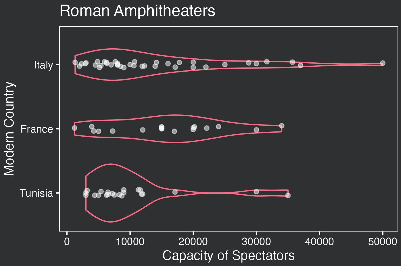
Note that amphitheaters in the territory of modern Tunisia tended to have less variation in their capacity and most of them were below 10,000 spectators. On the other hand, amphitheaters in the Italian Peninsula exhibit greater variation.
Can you guess what the outlier on the very right of the Italian distribution is? Yes! It’s the Flavian Amphitheater at Rome, also known as the Colosseum, with an impressive capacity of 50,000 people. If you have any questions, please feel free to comment below!
4. Conclusions
- A violin plot, a type of density curve, is useful for exploring data distribution;
- Coding a ggplot2 violin plot can be easily accomplished with
geom_violin().
Comments
There are currently no comments on this article, be the first to add one below
Add a Comment
If you are looking for a response to your comment, either leave your email address or check back on this page periodically.