From R to Tableau - Leverage Both Tools for Effective Dashboards
What you will learn
- Use the pinochet R package to analyze data.
- Create and publish visualizations using Tableau Public.
- Compare the strengths of R and Tableau for dashboard creation.
Table of Contents
- 1. The pinochet Package
- 2. Tableau Public
- 3. The Dashboard and Key Insights
- 4. Conclusions and Limitations
When the violence causes silence, we must be mistaken.
Zombie, The Cranberries (1994)
Data analysis can be more than quarterly KPIs or complicated statistical models — it can help us remember and critically retell our past. While Latin America is often viewed as a peaceful region, the second half of the 20th century saw several brutal authoritarian regimes. Chile’s dictatorship (1973‑1990) was among the most violent.
In this post, I show how I used an R package to obtain data about the victims of Chile’s dictatorship and visualize it in Tableau Public. You’ll also discover the strengths and limitations of each tool for dashboard creation.
1. The pinochet Package
Developed by Professor Danilo Freire and colleagues, the pinochet R package provides clean and tidy data on victims of the Chilean dictatorship. Each row in the dataset represents one individual.
content_copy Copy
install.packages("pinochet")

library(pinochet)

data(pinochet)  # loads the data in a data frame called pinochet

str(pinochet)   # explores the structure of the data frame
R excels at complex tasks — such as causal inference and statistical analyses — and it is equally powerful (and free) for data exploration and interactivity. With Shiny, you can build attractive dashboards entirely in R. However, mastering Shiny and producing polished interactive visuals with libraries like Plotly can take significant time and practice.
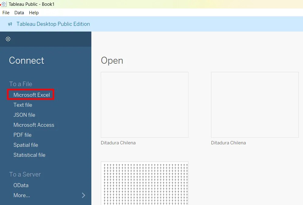
In this context, Tableau Public is an appealing option. It is the free edition of Tableau, designed for exploring public datasets and building engaging dashboards, while you learn. Tableau is a drag-and-drop tool that lets you create visualizations without writing code. As noted earlier, it is less versatile than R, but it is also easier to learn and use. In just a few hours, you can build beautiful exploratory dashboards using drag-and-drop alone. That’s why I chose Tableau to visualize this data. To bring the dataset into Tableau, I saved it as an Excel (.xlsx) file.
content_copy Copy
library(writexl)

write_xlsx(pinochet, "pinochet.xlsx")
2. Tableau Public
Tableau Public is a free, public platform for exploring, creating, and sharing data visualizations. It offers a more limited version of the well-known data visualization tool, Tableau.
Tableau, like ggplot2, has its roots in the Grammar of Graphics, a framework for understanding and creating visualizations. Within this framework, a plot is built by mapping data variables to visual aesthetics. In Tableau, this mapping is accomplished through drag-and-drop: you literally place fields onto the X-axis, Y-axis, Color shelf, and so on.
In contrast, ggplot2 mappings happen through code:
content_copy Copy
ggplot(data = df, aes(x = x, y = y, color = gender)) + geom_point()You can download Tableau Public Desktop in the official Tableau webpage. When you open it, you can easily load the Excel file you saved from R by selecting a connection to Microsoft Excel or Text File (if you prefer to save it as a .csv)
Please, check out this tutorial to learn more about Tableau Public. You can also download my Tableau workbook, that contains the dashboard, and check out how I created the full dashboard. Don’t forget to leave a star if you enjoy it! 🙂
3. The Dashboard and Key Insights
3.1 The Dashboard
The dashboard is organized into four interactive sections:
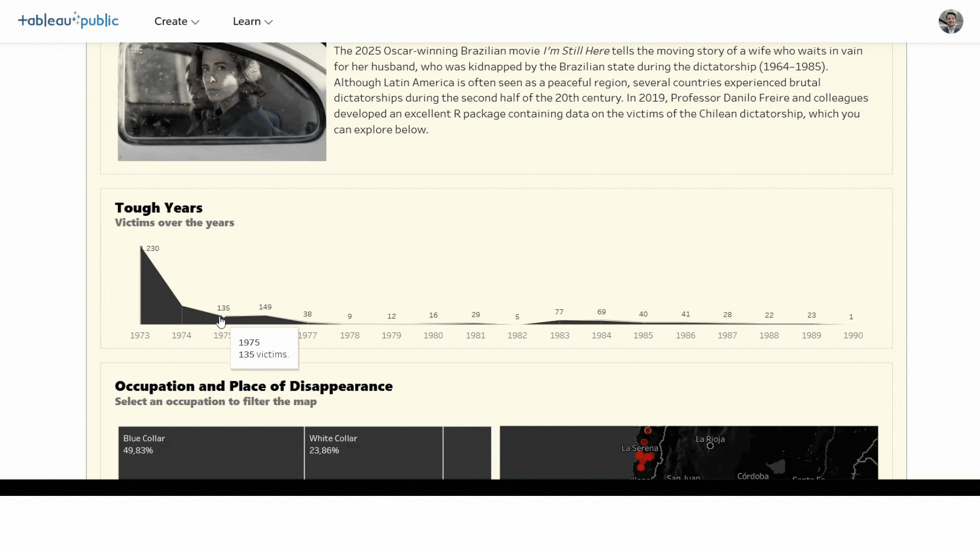
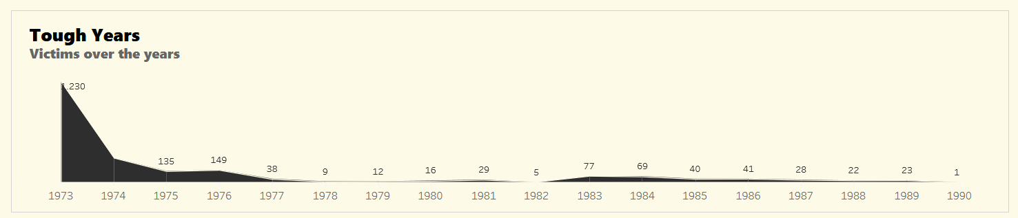
1. Tough Years
A bar chart of victims per year.
Tip: Scrub over the bars to filter by year.
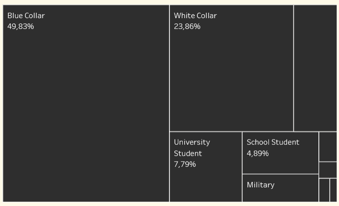
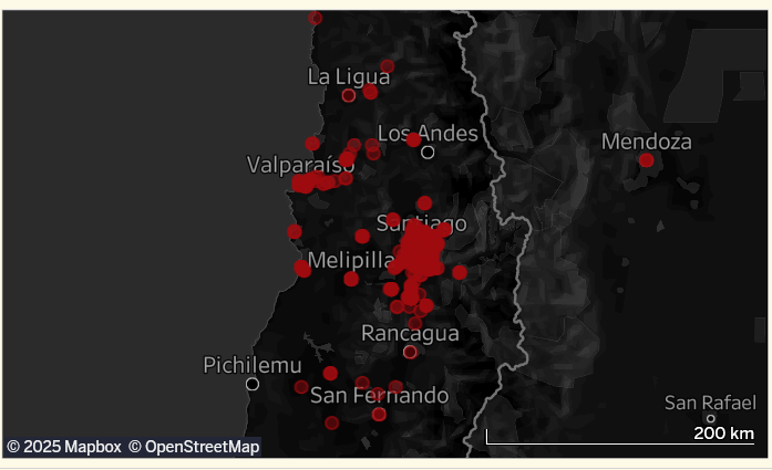
2. Occupation & Place of Disappearance
Treemap and map views.
Tip: Click an occupation to highlight where those victims disappeared.
3. An Exploratory Memorial
One star per confirmed victim.
Tip: Hover to read personal details.
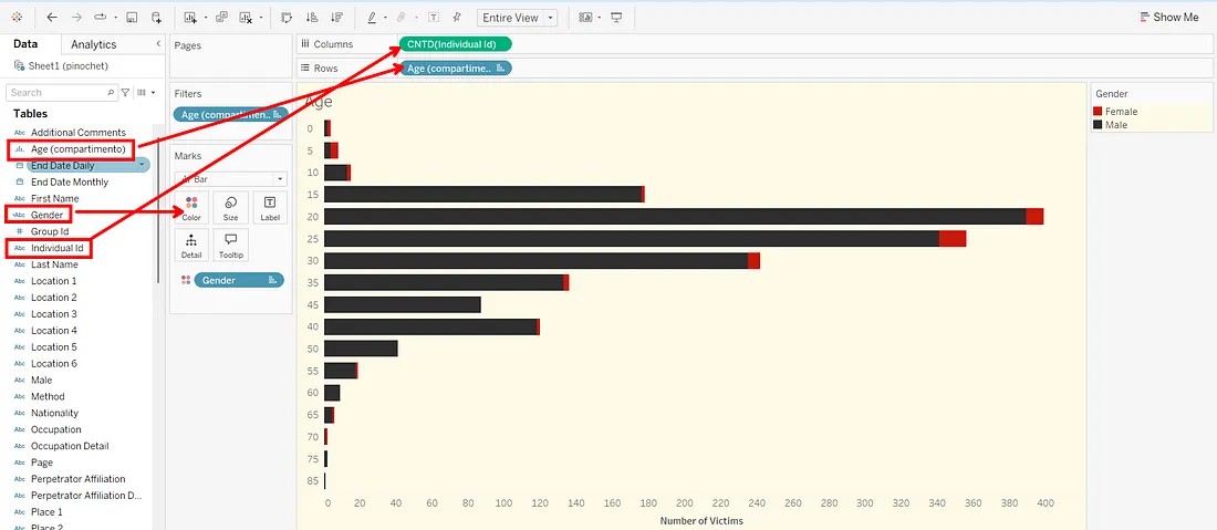
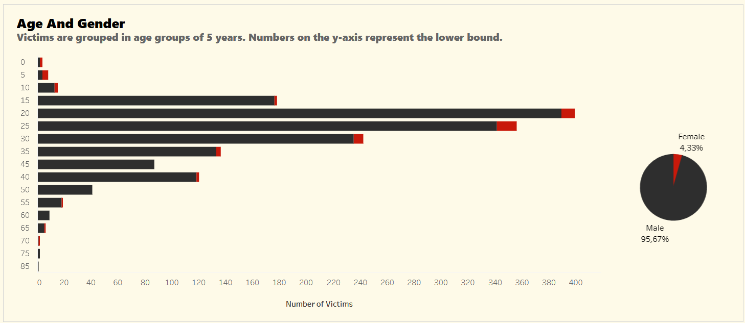
4. Age & Gender
Histogram split by gender.
Tip: Hover bars to see counts; toggle genders in the legend.
3.2 Key Insights
Here are some insights from the dashboard:
1973 was the deadliest year, with ~1,230 victims during the coup.
Blue-collar workers made up almost half the victims, revealing a class dimension of state violence.
Students (university and school) accounted for nearly 13% of the disappeared — a stark cost of activism.
96% of the victims were male, but the women’s stories reveal deep family traumas.
Most victims were between 20–30 years old — showing how youth were disproportionately targeted.
No place was safe — from Santiago to remote mining towns, disappearances happened everywhere.
4. Conclusions and Limitations
Tableau is a user-friendly tool for creating visual dashboards — especially good for quick exploration and sharing. It supports traditional charts and maps, and its drag‑and‑drop interface is great for beginners.
However, it has limitations. It lacks advanced statistical tools and doesn’t support robust preprocessing or modeling tasks. That’s where R truly shines.
Used together, R and Tableau offer a powerful combo for data-driven storytelling.
Data Source: Freire, D., Mingardi, L., & McDonnell, R. (2019). pinochet: Data About the Victims of the Pinochet Regime, 1973–1990
Link to Tableau Public Dashboard
What other historical datasets would you like to see visualized? Share your ideas in the comments below!
Comments
There are currently no comments on this article, be the first to add one below
Add a Comment
If you are looking for a response to your comment, either leave your email address or check back on this page periodically.