Text Data Visualization
What you will learn
- Learn to load and tokenize text data into Python;
- Be able to clean your data to retain only the relevant information;
- Learn to count words in a list;
- Be comfortable with visualizing text data;
Table of Contents
Introduction
“Words have no power to impress the mind without the exquisite horror of their reality.”
Edgar Allan Poe
Have you ever found yourself submerged in text data, your eyes scanning countless words as you try to extract meaningful insights for your research? Text data visualization could be the solution you’re seeking. In our modern world, textual data, be it from historical documents or the latest tweets, has become a deep well of knowledge just waiting to be discovered.
Whether you’re tracing societal trends over time or studying the latest social media topics, analyzing and visualizing text data can be a gold mine. In this lesson, we’ll guide you on how to navigate this rich universe of words. Harnessing the strength of Natural Language Toolkit (NLTK) and the Matplotlib library, we’ll delve into strategies for text data visualization and analysis, illuminating new angles for your research.”
Data source
The data used in this lesson is available on the Oxford Text Archive website. It consists of a collection of pamphlets published between 1750 and 1776 by influential authors in the British colonies. These pieces depict the debate with England over constitutional rights, showing the colonists’ understanding of their contemporary events and the conditions that precipitated the American Revolution. In this lesson, we will focus on the pamphlets of Oxenbridge Thacher, James Otis, and James Mayhew. To know more about textual data sources, check this post: ‘Where to find and how to load historical data’
Coding the past: text data visualization
1. Import text file into python
To load text files in Python and reuse our code, we can build a function. Before we start to write the function, all libraries necessary for this lesson will be loaded.
Using the with statement will ensure that the opened file is closed when the block inside it is finished. Note that we use “latin-1” encoding. The function islice() creates an iterable object and a for loop is used to slice the file into chunks (lines). Each line is appended to the list my_text.
word_tokenize is a function from the NLTK library that splits a sentence into words. All the sentences are then split into words and stored in a list. Note that the list needs to be flattened into a single list, since the tokenizer returns a list of lists. This is done with a list comprehension.
content_copy Copy
from itertools import islice
from nltk.tokenize import word_tokenize
nltk.download('stopwords')
from nltk.corpus import stopwords
import pandas as pd
import matplotlib.pyplot as plt

def load_text(filename):
    my_text = list()
    with open(filename, encoding= "latin-1") as f:
        for line in islice(f, 0, None):
            my_text.append(line)
    my_text = [word_tokenize(sentence) for sentence in my_text]
    flat_list = [item for sublist in my_text for item in sublist]
    return flat_list
Now we load the manifests of three authors: Oxenbridge Thacher, James Otis, and James Mayhew. The results are stored in three lists called thacher, otis, and mayhew.
content_copy Copy
thacher = load_text('thacher-2021.txt')
otis = load_text('otis-2021.txt')
mayhew = load_text('mayhew2-2021.txt')
If you check the length of the lists, you will see that Oxenbridge Thacher’s manifest has approximately 4,156 words; James Mayhew, 18,969 words; and James Otis, 34,031 words.
2. Understand nltk stopwords
In this function, we will use NLTK stopwords to remove all words that do not add any meaning to our analysis. Moreover, we transform all characters to lowercase and remove all words containing two or fewer characters.
content_copy Copy
def prepare_text(list_of_words):
  #load stopwords:
  stops = stopwords.words('english')
  #transform all word characters to lower case:
  list_of_words = [word.lower() for word in list_of_words]
  #remove all words containing up to two characters:
  list_of_words = [word for word in list_of_words if len(word)>2]
  #remove stopwords:
  list_of_words = [word for word in list_of_words if word not in stops]
  return list_of_words
We apply the function to the three lists of words. After the cleaning process, the number of words is reduced to less than 50% of the original size.
content_copy Copy
thacher_prepared = prepare_text(thacher)
otis_prepared = prepare_text(otis)
mayhew_prepared = prepare_text(mayhew)
3. Word counter in python
The function below counts the frequency of each word and returns a dataframe with the words and their frequencies, sorted by the frequency.
content_copy Copy
def count_freq(my_list):
    unique_words = []
    counts = []
    # create a list of unique words:
    for item in my_list:
      if item not in unique_words:
        unique_words.append(item)
    # count the frequency of each word:
    for word in unique_words:
      count = 0
      for i in my_list:
        if word == i:
          count += 1
      counts.append(count)
    # create a dataframe with the words and their frequencies:
    df = pd.DataFrame({"word": unique_words, "count": counts})
    df.sort_values(by="count", inplace = True, ascending = False)
    df.reset_index(drop=True, inplace = True)
    return df

thacher_df = count_freq(thacher_prepared)
otis_df = count_freq(otis_prepared)
mayhew_df = count_freq(mayhew_prepared)
4. Word count visualization
We will use the matplotlib library to create a bar plot with the 10 most frequent words in each manifest. We use iloc to select the first 10 rows of each dataframe. barh creates a horizontal bar plot where the words are on the y-axis and the frequency on the x-axis. After that, we set the title of each plot and perform a series of adjustments to the plot, including the elimination of the grid, the removal of part of the frame, and the change in font and background colors. Finally we also use the tight layout function to adjust the spacing between the plots.
content_copy Copy
thacher_10 =thacher_df.iloc[:10]
otis_10 = otis_df.iloc[:10]
mayhew_10 = mayhew_df.iloc[:10]

fig, (ax1, ax2, ax3) = plt.subplots(1,3, figsize=(12, 4))

# horizontal barplot:

ax1.barh(thacher_10["word"], thacher_10["count"],
        color = "#f0027f",
        edgecolor = "#f0027f")

ax2.barh(otis_10["word"], otis_10["count"],
        color = "#386cb0",
        edgecolor = "#386cb0")

ax3.barh(mayhew_10["word"], mayhew_10["count"],
        color = "#fdb462",
        edgecolor = "#fdb462")

# title:
ax1.set_title("Thacher")
ax2.set_title("Otis")
ax3.set_title("Mayhew")

# iterate over ax1, ax2, ax3 to:
# invert the y axis;
# eliminate grid;
# set fonts and background colors;
# eliminate spines;
for ax in fig.axes:
    ax.invert_yaxis()
    ax.grid(False)
    ax.title.set_color('white')
    ax.tick_params(axis='x', colors='white')
    ax.tick_params(axis='y', colors='white')
    ax.set_facecolor('#2E3031')
    ax.spines["top"].set_visible(False)
    ax.spines["right"].set_visible(False)
    ax.spines["left"].set_visible(False)

# fig background color:
fig.patch.set_facecolor('#2E3031')
# layout:
fig.tight_layout()

plt.show()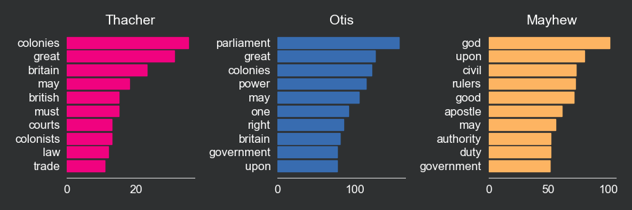
5. Calculate the proportion of each word and comparing the manifests
Finally, we calculate the proportion of each word in each manifest relative to the total number of words in that document and store them in a new column called “proportion”. We also create two new data frames, one for each pair of manifests: one to compare Thacher and Otis, and the other to compare Thacher and Mayhew. This is done by an outer join, using the word column as the key. This operation keeps all the words, even the ones that are not included in both datasets, and fills the missing values with 0.
content_copy Copy
thacher_df["proportion"] = thacher_df["count"]/sum(thacher_df["count"])
otis_df["proportion"] = otis_df["count"]/sum(otis_df["count"])
mayhew_df["proportion"] = mayhew_df["count"]/sum(mayhew_df["count"])

thacher_otis = thacher_df[["word", "proportion"]].merge(
    otis_df[["word", "proportion"]],
    on = "word",
    how = "outer",
    suffixes = ("_thacher", "_otis")).fillna(0)

thacher_mayhew = thacher_df[["word", "proportion"]].merge(
    mayhew_df[["word", "proportion"]],
    on = "word",
    how = "outer",
    suffixes = ("_thacher", "_mayhew")).fillna(0)
Now we will compare the three manifests by plotting the proportion of each word in Thacher on the x-axis and the proportion of the same word in Otis on the y-axis. We will use the scatter function to create a scatter plot in which the coordinates are the frequencies of a given word in Thacher and Otis. We will also use the annotate function to label each point with the word. The same procedure will be used to compare Thacher and Mayhew. Note that the more similar the manifests, the more points will be concentrated in the diagonal line (same frequency in both manifests).
content_copy Copy
fig, ax = plt.subplots()

# scatterplot:
ax.scatter(thacher_otis["proportion_thacher"], thacher_otis["proportion_otis"], color = "#f0027f", alpha = 0.5)

# annotate words:
for i, txt in enumerate(thacher_otis["word"]):
    ax.annotate(txt,
                (thacher_otis["proportion_thacher"][i],
                 thacher_otis["proportion_otis"][i]),
                 color = "white",
                 alpha = 0.7)

# eliminate grid:
ax.grid(False)

# x axis label:
ax.set_xlabel("Thacher")

# y axis label:
ax.set_ylabel("Otis")

# diagonal dashed line:
ax.plot([0, 0.02], [0, 0.012], color = "gray", linestyle = "--")

# fig background color:
fig.patch.set_facecolor('#2E3031')

# ax background color:
ax.set_facecolor('#2E3031')

# x and y axes labels font color to white:
ax.xaxis.label.set_color('white')
ax.yaxis.label.set_color('white')


# ax font colors set to white:
ax.tick_params(axis='x', colors='white')
ax.tick_params(axis='y', colors='white')

# set spines to false:
ax.spines["top"].set_visible(False)
ax.spines["right"].set_visible(False)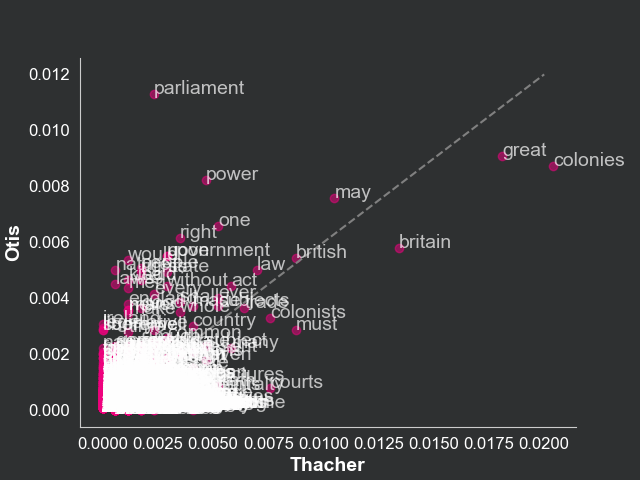
content_copy Copy
# plot scatterplot with words:
fig, ax = plt.subplots()

ax.scatter(thacher_mayhew["proportion_thacher"],
           thacher_mayhew["proportion_mayhew"],
           color = "#f0027f",
           alpha = 0.5)

for i, txt in enumerate(thacher_mayhew["word"]):
    ax.annotate(txt, (thacher_mayhew["proportion_thacher"][i],
                      thacher_mayhew["proportion_mayhew"][i]),
                      color = "white",
                      alpha = 0.7)
# eliminate grid:
ax.grid(False)
# x axis label:
ax.set_xlabel("Thacher")
# y axis label:
ax.set_ylabel("Mayhew")
# diagonal dashed line:
ax.plot([0, 0.02], [0, 0.012],
        color = "gray",
        linestyle = "--")

# fig background color:
fig.patch.set_facecolor('#2E3031')

# ax background color:
ax.set_facecolor('#2E3031')

# x and y axes labels font color to white:
ax.xaxis.label.set_color('white')
ax.yaxis.label.set_color('white')


# ax font colors set to white:
ax.tick_params(axis='x', colors='white')
ax.tick_params(axis='y', colors='white')

# set spines to false:
ax.spines["top"].set_visible(False)
ax.spines["right"].set_visible(False)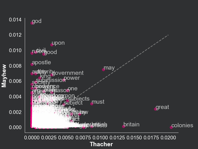
This text data visualization highlights the fact that Thacher and Otis are more similar than Thacher and Mayhew. This is reflected in the scatterplot, where the points are more concentrated in the diagonal line in the plot relating Thacher and Otis compared to the one relating Thacher and Mayhew. This is a simple way to compare the similarity of two texts. We know, for example, that, while Thacher talks a lot about “colonies”, Mayhew talks a lot about “god”.
Conclusions
- You can tokenize text data with the NLTK library method
word_tokenize; - With list comprehensions, you can treat text to eliminate irrelevant characters and words;
- Matplotlib is an excellent option for text data visualization
Comments
There are currently no comments on this article, be the first to add one below
Add a Comment
If you are looking for a response to your comment, either leave your email address or check back on this page periodically.