Checking normality in R
What you will learn
- Learn the concept of the normal distribution;
- Be able to tell if your data follows the normal distribution in R;
- Be confident in visualizing and interpreting the normal distribution in R;
- Learn how to calculate probabilities of normally distributed data.
Table of Contents
Introduction
“The normal distribution describes the manner in which many phenomena vary around a central value that represents their most probable outcome”
Leonard Mlodinow
In this lesson, we will dive into the concept of the normal distribution, which is a fundamental concept within statistics. Also known as the Gaussian distribution or bell curve, the normal distribution is a symmetric probability distribution that manifests in numerous natural and social phenomena. During this lesson, we will employ the Swiss dataset to examine and visualize the normal distribution. This dataset comprises the infant mortality rate of 47 French-speaking provinces in Switzerland around 1888.
Data source
The Swiss Fertility and Socioeconomic Indicators (1888) Data is available in the datasets R package and was originally used in Data Analysis and Regression: A Second Course in Statistics by Mosteller and Tukey (1977).
Coding the past: testing normality in R
1. What is a normal distribution?
As we learned from the lesson ‘Z score in R’, a distribution of data illustrates the frequency of occurrence for different values of a variable. One common way to visualize a distribution is through a histogram.
The normal distribution is a particular kind of data distribution characterized by the following aspects:
- approximately 95% of all observations of the data fall within 2 standard deviations from the mean. This means that the vast majority of data points cluster closely around the average value;
- when visualized with a histogram, it forms a symmetrical bell-shaped curve. This symmetry indicates that the distribution’s shape is identical on both sides of the mean.
- three important measures of central tendency coincide - the mean, the mode, and the median. This implies that the average value, the most frequently occurring value, and the middle value of the dataset tend to be all equal.
2. What is rnorm in R?
Suppose we want to generate a dataset of heights that follows a normal distribution in R. Specifically, we aim to generate the heights of 1,000 students with a mean of 175 cm and a standard deviation of 5 cm. R provides a function called rnorm that generates normally distributed data. It takes three arguments: the number of observations you would like to be generated, mean, and standard deviation. In the code below, we generate a normally distributed dataset and plot its histogram.
To ensure reproducibility, we use set.seed(42) to obtain the same set of numbers every time the code is run. Moreover, to customize our plot, we will use the ggplot theme developed in the lesson ‘Climate data visualization’.
content_copy Copy
library(ggplot2)
library(dplyr)

set.seed(42)

#Generating normally distributed data

heights <- data.frame(heights = rnorm(1000, 175, 5))

#Checking the summary statistics

summary(heights$heights)
sd(heights$heights)


theme_coding_the_past <- function() {
  theme_bw()+
  theme(# Changes panel, plot and legend background to dark gray:
        panel.background = element_rect(fill = '#2E3031'),
        plot.background = element_rect(fill = '#2E3031'),
        legend.background = element_rect(fill="#2E3031"),
        # Changes legend texts color to white:
        legend.text =  element_text(colour = "white"),
        legend.title = element_text(colour = "white"),
        # Changes color of plot border to white:
        panel.border = element_rect(color = "white"),
        # Eliminates grids:
        panel.grid.minor = element_blank(),
        panel.grid.major = element_blank(),
        # Changes color of axis texts to white
        axis.text.x = element_text(colour = "white"),
        axis.text.y = element_text(colour = "white"),
        axis.title.x = element_text(colour="white"),
        axis.title.y = element_text(colour="white"),
        # Changes axis ticks color to white
        axis.ticks.y = element_line(color = "white"),
        axis.ticks.x = element_line(color = "white")
  )
}


ggplot(data = heights, aes(x = heights))+
  geom_histogram(fill = "#FF6885", color = "#FF6885", alpha = 0.6)+
  ylab("Count")+
  xlab("Height [cm]")+
  theme_coding_the_past()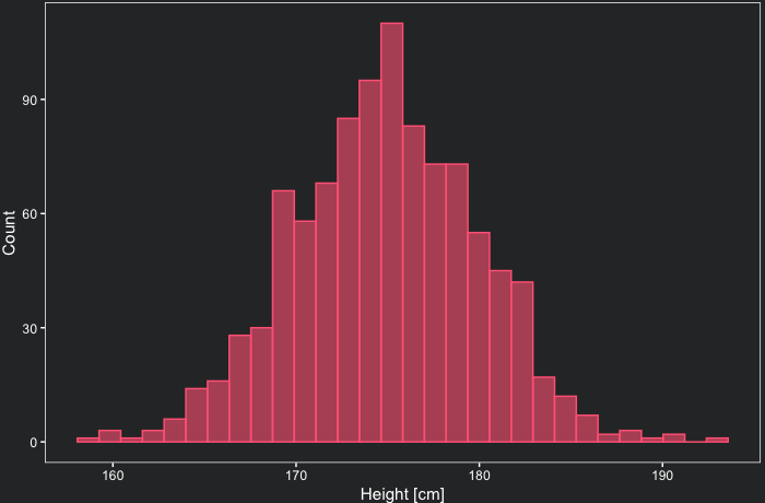
As you can see, the distribution has a bell shape and is approximately symmetric, with data centered mostly around the mean (175 cm). According to the summary statistics, the shortest person in our sample measures 158.1 cm, while the tallest stands at 192.5 cm. Besides that, the standard deviation is very close to 5 cm.
Based on our definition, approximately 95% of the observations should fall within a range of minus 2 standard deviations from the mean to plus 2 standard deviations from the mean. Now, let us verify if this holds true for our specific example.
content_copy Copy
std_dev <- sd(heights$heights)

heights %>%
  filter(heights>175 + 2*std_dev | heights< 175 - 2*std_dev) %>%
  nrow()
As expected, only 47 out of 1000 observations, or 4.7%, are more than 2 standard deviations away from the mean.
3. R swiss dataset
Now, let’s examine whether infant mortality rates in 47 provinces of Switzerland in about 1888 follow a normal distribution. Before plotting the histogram, we should first verify if the mean and median of our data points are approximately equal, as is typically the case in a normal distribution, as mentioned earlier. The swiss dataset can be directly loaded to a variable as shown in the code below.
content_copy Copy
df <- swiss

sd(df$Infant.Mortality)
mean(df$Infant.Mortality)
median(df$Infant.Mortality)
The standard deviation of infant mortality is 2.91 and its mean is 19.94255. Note that indeed the mean and the median (20) are very similar. Below we plot the histogram to check the shape of our distribution. We also check how many observations are more than 2 standard deviations away from the mean.
content_copy Copy
ggplot(data = df, aes(x = Infant.Mortality))+
  geom_histogram(fill = "#FF6885", color = "#FF6885", alpha = 0.6)+
  ylab("Count")+
  xlab("Infant Mortality")+
  theme_coding_the_past()

df %>%
  filter(Infant.Mortality>19.94255 + 2*2.91 | Infant.Mortality< 19.94255 - 2*2.91) %>%
  nrow()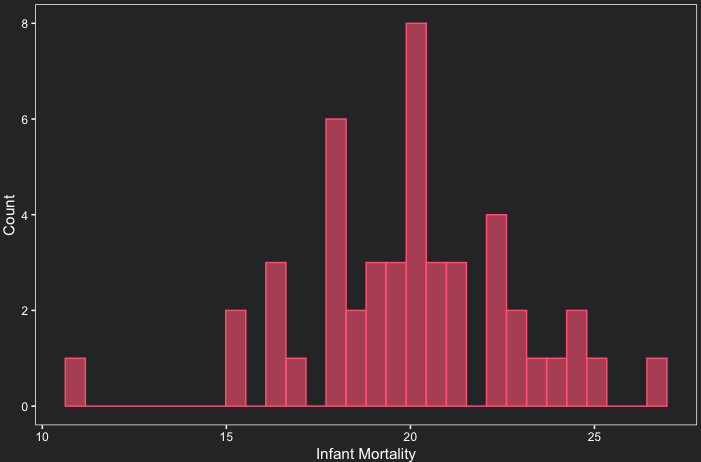
The shape appears to be of a normal distribution, slightly skewed to the left. Furthermore, only 2 out of 47 observations, or 4.2%, in our distribution are more than 2 standard deviations away from the mean. This also suggests that our data is indeed normally distributed.
4. Probability Density Function in R
A density curve follows the shape of the histogram of the data, but instead of providing the frequency of each value, the area under this curve provides the probability that a certain range of values will occur. For the normal distribution, the density curve is defined as a function \(f(x)\) dependent on \(\mu\) (mean) and \(\sigma\) (standard deviation).
\[f(x) = \frac{1}{\sigma \sqrt{2\pi}}e^{-\frac{(x-\mu)^{2}}{2\sigma^2}}\]With the formula above, we can implement this function in R to calculate the density for each value of our data.
content_copy Copy
calculate_density <- function(x, mean, st_dev){
  d = (1/(st_dev*sqrt(2*pi)))*exp(1)^(-((x-mean)^2/(2*st_dev^2)))
  return(d)
}
Now we can calculate the density for each data point of the infant mortality variable and plot the density as a function of the data points.
content_copy Copy
df$density <- calculate_density(df$Infant.Mortality, 19.94255, 2.91)

ggplot(data=df, aes(x = Infant.Mortality, y = density))+
  geom_line(color = "#FF6885")+
  ylab("Density")+
  xlab("Infant Mortality")+
  theme_coding_the_past()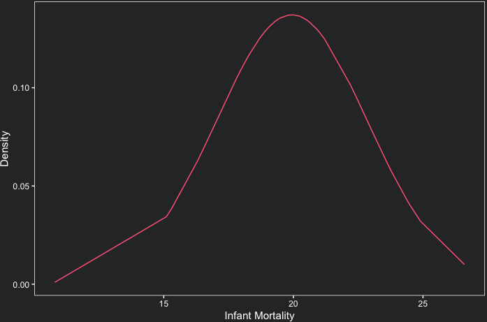
Note that the curve does not form a perfect bell shape due to the limited number of observations.
Fortunately, you do not need to create these functions manually in order to plot a density plot. Firstly, R offers a built-in function called dnorm that performs the same calculations as the calculate_density function we created earlier. It accepts identical arguments. Additionally, the ggplot2 package includes a layer called geom_density which calculates the density and plots it simultaneously. Let’s explore this functionality in the example below.
content_copy Copy
ggplot(data = df, aes(x = Infant.Mortality))+
  geom_density(color = "#FF6885", alpha = 0.6, bw = 1.5)+
  ylab("Density")+
  xlab("Infant Mortality")+
  theme_coding_the_past()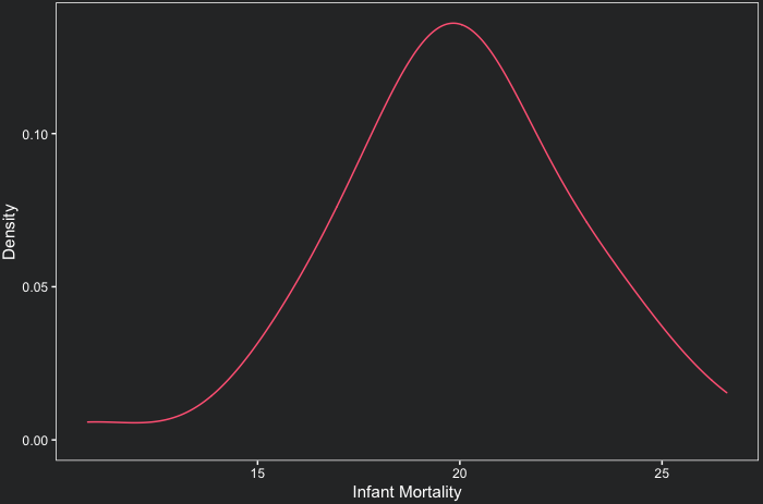
Note that the geom_density computes kernel density estimates and allows you to control how smooth the curve is through the bw argument. The higher the value of bw, the smoother the curve.
But, after all, why are density curves so important?
That is because the area under these curves gives us the probability that a certain range of values occurs. Calculating the area under a curve typically requires integration. However, as an approximation, we can approximate the probability of finding Swiss provinces with infant mortality rates ranging from 19 to 21 without resorting to integrals. To do this, we draw a rectangle that approximates the area under the curve within this interval. The plot below illustrates this approach.
content_copy Copy
ggplot(data = df, aes(x = Infant.Mortality))+
  geom_density(color = "#FF6885", alpha = 0.6, bw = 1.5)+
  ylab("Density")+
  xlab("Infant Mortality")+
  annotate("rect", xmin = 19, xmax = 21, ymin = 0, ymax = 0.13,
           alpha = .5, fill = "#FF6885")+
  theme_coding_the_past()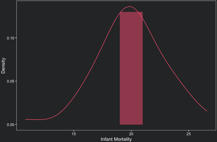
The area of the rectangle can be calculated by multiplying 2 (width) by 0.13 (height) which results in 0.26. This means that the probability of finding a province with infant mortality between 19 and 21 is 26%.
5. How to use pnorm in R
There is a function in R called pnorm that calculates the probability of an interval of values occurring in a normal distribution. The first argument, x, specifies the interval for which the probability is to be calculated. By default, the calculated probability corresponds to the interval of values to the left of x. You can change this behavior by setting lower.tail to FALSE.
For instance, if we would like to calculate the probability of finding a province with infant mortality lower than or equal to 21, then our first argument is 21. The second argument is the mean, and the third is the standard deviation. Below we also plot the density curve that highlights the area under the curve within the interval of interest.
content_copy Copy
ggplot(data = df, aes(x = Infant.Mortality))+
  geom_density(fill = "#FF6885", color = "#FF6885", alpha = 0.6, bw = 1.5)+
  ylab("Density")+
  xlab("Infant Mortality")+
  annotate("rect", xmin = 21, xmax = 27, ymin = 0, ymax = 0.13, fill = '#2E3031', alpha =0.7)+
  theme_coding_the_past()

pnorm(21, 19.94, 2.91)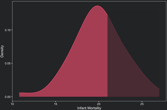
The probability of finding a province with infant mortality lower than or equal to 21 is represented by the unshaded red area and is 64.2%.
To find the probability of a value between 19 and 21, we have to subtract the probability of infant mortality lower than or equal to 19 from the 64.2%, as depicted in the plot below.
content_copy Copy
ggplot(data = df, aes(x = Infant.Mortality))+
  geom_density(fill = "#FF6885", color = "#FF6885", alpha = 0.6, bw = 1.5)+
  ylab("Density")+
  xlab("Infant Mortality")+
  annotate("rect", xmin = 21, xmax = 27, ymin = 0, ymax = 0.13, fill = '#2E3031', alpha =0.7)+
  annotate("rect", xmin = 10, xmax = 19, ymin = 0, ymax = 0.13, fill = '#2E3031', alpha =0.7)+
  theme_coding_the_past()

pnorm(21, 19.94, 2.91) - pnorm(19, 19.94, 2.91)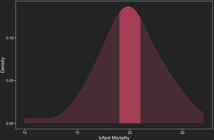
According to pnorm, the probability of finding a province with infant mortality between 19 and 21 is 26.9%, very close to our rectangle area approximation (26%).
6. Z-score probability in R
You can also use pnorm to calculate probabilities with Z-scores. In this case, you only pass the z-score to the function. For example, let us calculate the probability that a province has infant mortality lower than or equal to 21. First, 21 corresponds to a z-score of (21-19.94)/2.91, or 0.36. Now we can pass this z-score to the function pnorm(0.36) to obtain the probability of 64.2%, as we had already calculated above!
7. Testing normality with a Shapiro-Wilk test
The Shapiro-Wilk test is a statistical test that can be used to test the normality of a sample. The test gives us a p-value. If the p-value is less than 0.05, then the distribution in question is significantly different from a normal distribution. Otherwise, we can consider that the distribution is normal. Below we test the normality of our variable.
content_copy Copy
shapiro.test(df$Infant.Mortality)The Shapiro-Wilk test results in a p-value of 0.4978 which is greater than 0.05. Therefore, we can consider that the distribution of infant mortality in the Swiss provinces is normal.
Conclusions
- The normal distribution manifests in numerous natural and social phenomena and is characterized by the following aspects:
- approximately 95% of all observations of the data fall within 2 standard deviations from the mean;
- when visualized with a histogram, it forms a symmetrical bell-shaped curve;
- three important measures of central tendency coincide: the mean, the mode, and the median;
- The
rnormfunction generates normally distributed data in R; - The area under the density curve gives us the probability that a certain range of values occurs;
- The
pnormfunction calculates the probability of an interval of values occurring in a normal distribution;
Comments
There are currently no comments on this article, be the first to add one below
Add a Comment
If you are looking for a response to your comment, either leave your email address or check back on this page periodically.